
Back in December 2014, we provided some renderings of a project going up on the triangular parcel bound by Speer Boulevard, 6th Avenue and Grant Street. We didn’t have any posts of the construction progress as some projects slip through the cracks, with all of the infill going on, but today we are going to take a look at the completed project.
The Speer Boulevard Apartments, now known as Gables Speer Boulevard, features 211 apartment units contained in a six story building. Because of the triangle shaped lot, this project has some neat perspectives. On one side of the street, the building looks very slender and comes together on the corner. Across the street, you get the full picture and see that it runs up to the property line on both Grant and Speer Boulevard.
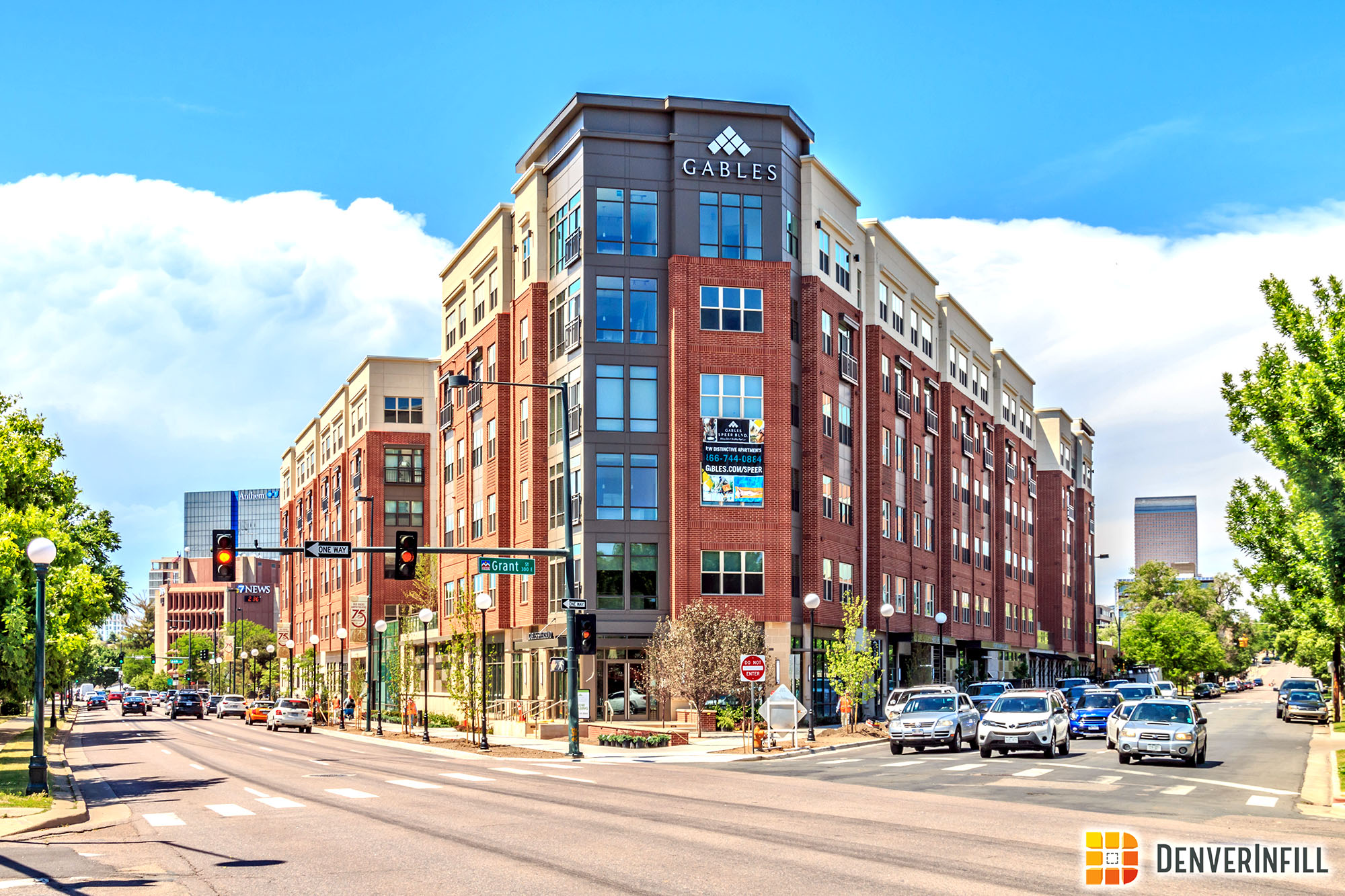

The facade is made up of dark paneling, stucco, and brick broken up throughout the project. It looks very balanced and the neutral colors compliment each other nicely.
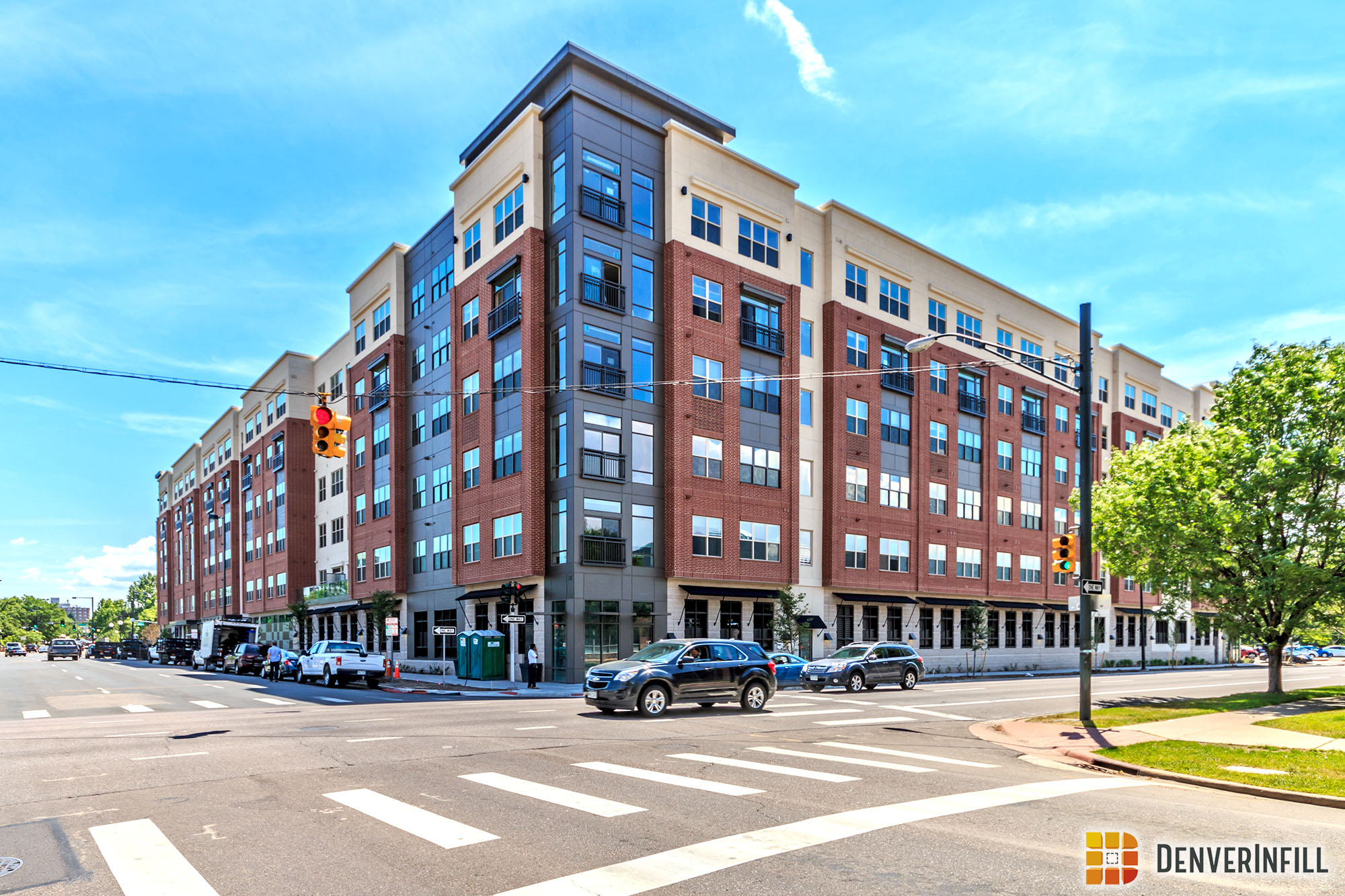

Here is one last street level perspective looking southeast along Speer Boulevard.


We don’t get a lot of new projects along the Cherry Creek River but it’s always neat when we can use it as a foreground for infill photos!


In my opinion, this project looks sharp. The colors are neutral, with both light and dark elements, it has clean lines, and features a very balanced facade. I would take this project over the gas station that used to sit here!


Can I offer an opinion? What architect in their right mind thought all that unsupported brick looks good? It looks unstable. Brick should never be cantilevered – It needs a visual base. This institutional hodgepodge of unrelated rectangles is sterile, uninviting and indistinguishable from a hospital or a tenement slum (which it probably will be in 20 years). Photos rely on Speer parkway trees or distance to hide the clumsy design. What you refer to as “a very balanced facade” looks cheap and uninspired.
You are Citizen Kane are truly insane.
Now that’s a nice looking building.
no, it’s not.
it violates very elementary principles that the architects should have learned in year two of school.
I’m guessing, at this point, that you are an architect and also that you have also worked on multi-family development. How is this building different than most multi-family that’s going in? It’s better than randomly colored EFIS that is are blue, red, gold and not natural looking. Not much you can do with a 5/6-story building.
This, in my opinion, is leaps and bounds better than a lot of the 5/6-story product we have been getting. If this design replaced other projects that are currently open in say Union Station, I’m sure everyone would accept this design over what’s currently there.
All in all, I don’t get your beef with every single project. All local and remote architect firms have designed products that look exactly like this, and I’m sure you’ve had to take on that burden too.
I agree with Ryan 100%! Especially his last comment. And, I am an architect and think this is a very reasonable building.
Spot on! Constructive criticism always has a place, but to argue that this project is barely better than the gas station it replaced is ridiculous. Great post!
I don’t have a beef with every single project. Look at my comments on SugarSquare for instance.
I also disagree that my comments are something other than constructive criticism. I’d refer you to the discussion about VIA which was well received even though it was critical of the project.
Anyway, my main complaint about this project is the floating brick volumes. Masonry is supposed to come to the ground, giving the building a solid base, depth, and grounding.
Floating masonry boxes are counter to this idea and feel ‘wrong’.
I’m also disappointed by the lack of density. The site allows 12 yet it’s only built to 6.
Those are my two biggest issues with the project. It’s certainly not the worst building in town, not the best either.
To say it’s barely better than a gas station is facetious. Obviously.
“All local and remote architect firms have designed products that look exactly like this”
THAT is the problem. Isn’t design and architecture all about creativity? Can’t we do better than simply filling in parking lots?
agreed. materiality and detailing done poorly. a building phoned in by a developer and architect from out of town who will never see the finished product and don’t have to live with the consequences it.
and maybe worst of all, this lot is zoned CMX-12, so it’s another lost opportunity for better density.
more crappy architecture that is nonetheless (barely) an improvement over the gas station that once stood there.
This building is just okay. It is better than many of the 5 story apartment buildings you see in Denver and around the country. At least it is a cohesive design and not a mish-mash of different styles. It surely could have been a lot better, but I don’t know that living on an island surrounded by major streets would be all that appealing. The developer should learn what a gable is though since there is not a single one on “The Gables.”
Gables is the developer
I note that the lights along the street are not full cut-off. Does Denver not have a policy for new development and for full cut-off fictures. Not sure the residence want more light in their homes or if it should be directed forwards the sidewalk?
This project made Westword’s Hateful Eight – in fact, it is number one on this dubious list!
Go to:
http://www.westword.com/arts/denver-is-drowning-in-awful-architecture-here-are-the-hateful-eight-7818984/2
Congratulations Gables!
It is ugly. Agree with the floating brick that looks out of place. Wish we had design standards like the mountain towns do.
Also wish they had retail in it along grant. So many missed opportunities here but when you are just look at the bottom line, investors don’t care. Sucks that our city cannot steer projects like these to better suite the neighbor’s and the neighborhood.
Thank you. I’m glad to see I’m not the only one who rues the missed opportunities with a project like this and longs for better architecture in Denver, rather than simply being satisfied with a parking lot being replaced.