

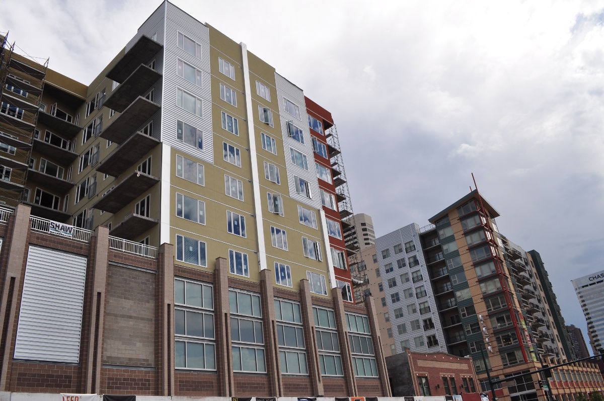
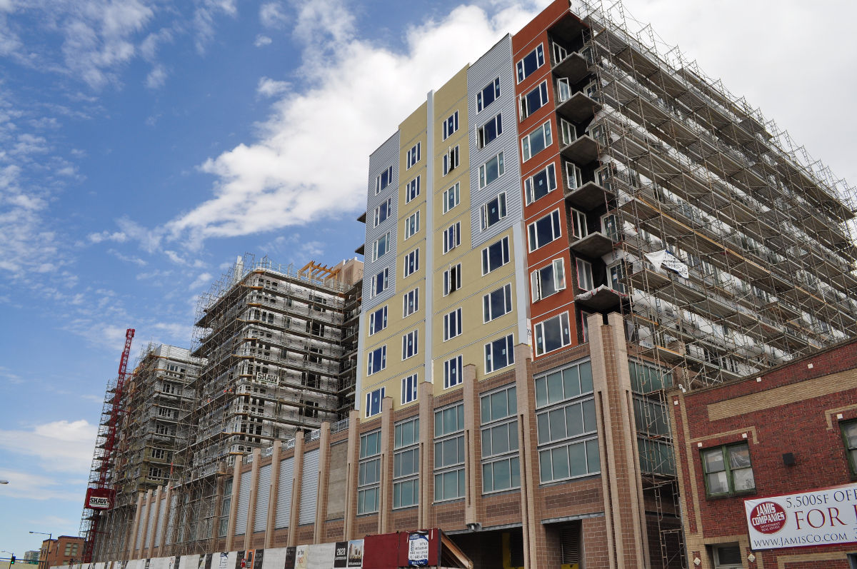
There comes that point in time in every development where the true colors start to show. As this is not a full update on 2020 Lawrence, there is a brand new element we haven’t seen yet.
The new facade. In the scaffolding labyrinth that has been surrounding the building for many months, a little bit of the building has come out to show its face. The color scheme is similar to its neighbor Solera. It will be very interesting to see this project when it’s finished. 2020 Lawrence is a huge building and therefore has huge influence on what the area is going to look like.
What do you think of the new element on 2020 Lawrence?


Bleh, cheap looking stucco and corrugated tin. I think it looks very plain and worse than Solera from what has been faced so far.
At least the lower brick floors present a little better face at street level, but the overall impression is underwhelming.
Horrible
The yellow looks like a middle finger, which is fitting, considering how ugly this will be.
The first 4 stories, however many feet that is, are great with a nice street presence. The facade above this will be just fine. Given the large size of this project the facade will make it less clunky looking. I think it will be simply delightful.
I don’t recall if this is to be LEED Gold as well or not, but the quality throughout the project is also important. Just look at that sucker…. this is not your everyday garden variety project. Wonderful addition to downtown. Sign me up!
I have to say I am a little disappointed in the exterior finishes, particularly the cinderblock. If cinderblock were that great of an exterior finish, why are they also putting in the alley where nobody sees it and nobody cares. Let’s face it – cinderblock is not a finish material any more today than it was 40 years ago. Let’s hope the developer abandons the idea that it is an acceptable finish material. It also seems the exterior finish is not as pronounced and exiting as the renderings we saw – it seems very washed out and bland. This is not the same level of steet appeal as Solera. But I do like the size and scope of the project. It could have been 5 stories higher for my taste.
Come on folks…it’s not THAT bad…please keep in mind that the building is not even close to finished yet. with the addition of lighting, cornice, mullions, balcony rails, etc. this will wrap up looking pretty nice. The scale is fantastic – E shaped building on an entire half-block is big-city stuff, and that’s great.
my one beef is the hideous color pallete – kind of a bland yellow, beige, light brown CMU and pepsi-center maroon on the corners…youch. luckily, that is something they can change in the future.
My first reaction, before reading these comments, was that this is ugly. Seems others agree. Too bad, as I had high hopes for something of the standard of Solera, which is very nice.
Looks better with the scaffolding in place. I do think that the middle section, which has substantially more glass, will help soften the rather stark side sections. It’s a decent filler building, buy yeah, one that could use an immediate paint job.
I’m not a big fan of synthetic stucco but I do like they’re color scheme. Anything but beige! I also think eventually the vast majority of the cinder block in front will be covered with a different material. (hopefully)Obviously you can’t truly judge any building until its completed but I think this place will look better than Solera.
Horrible ! complete waste of land.
On Sept. 20, ULI Colorado will tour 2020 Lawrence as part of a program highlighting Arapahoe Square development. The debate can continue there.