
I’m sure by now you have guessed the theme of the week: bringing you up to speed with all of the projects around the Golden Triangle. With an 18-story project, Eviva, just getting out of the ground down the street, Joule, formally known as EnV and 1000 Speer, is now complete with residents already occupying many of the units. Joule is a 16-story project providing 224 units to the Golden Triangle.
Here are all of our posts featuring Joule:
New Golden Triangle Project: EnV
More Tower Cranes Going Up Around Downtown Denver!
Spring 2014: Downtown Denver Hole-in-the-Ground Census
Golden Triangle: EnV Update #1
Golden Triangle: EnV Update #2
Joule features a color we don’t often see around Denver: white. Most of the building fronting Speer Boulevard has a white stucco facade. It may seem that the parking podium, covered with wood screening, also fronts Speer Boulevard however, that’s not the case. There is an alley between Joule and Speer Boulevard, making it a possibility that the podium will be covered by another project in the future.


Here are two views from the Sunken Gardens Park. The south end of the project features brown brick and a glass curtain wall.


Joule has a great presence along Speer Boulevard, which is already scattered with many projects of similar size.

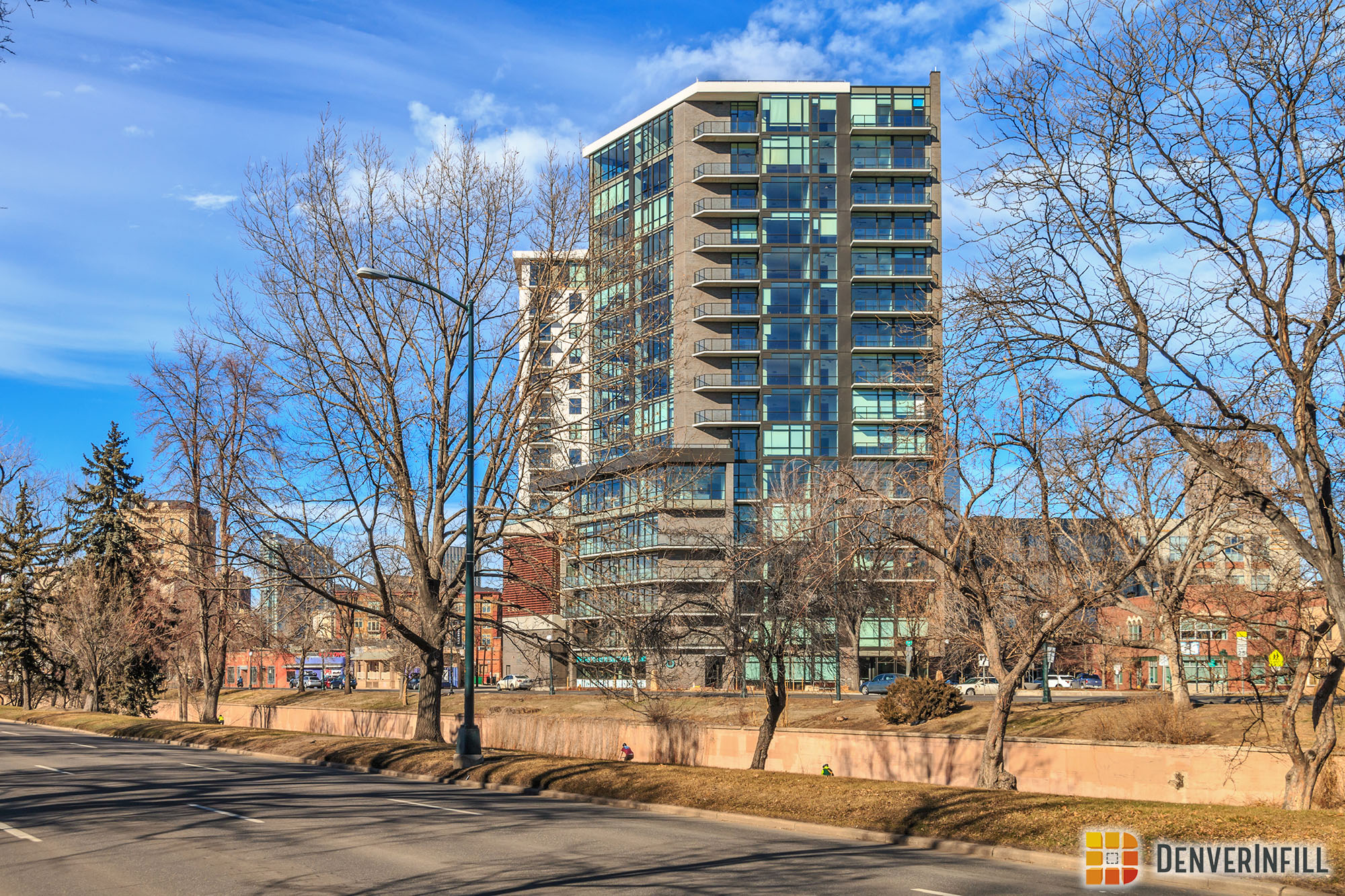
Finally, a look at the Cherokee Facing side. The glass, brown brick, and white stucco contrast the various beige high rises around the Golden Triangle. Joule is quite a refreshing sight from a materials standpoint.

Joule has great colors, material, and scale for the Golden Triangle. Welcome to the neighborhood!


Great pictures, Ryan! I live a few blocks away and man, this thing flew up, compared to the much smaller Vita over on Lincoln. It looks like a high quality product with concrete floors all the way to the top and is definitely condo-ready for down the road. I’m anxious to see what the new influx of residents will bring for the Golden Triangle – I think very exciting times are ahead for the sleepy neighborhood.
However, is it just me or is anyone else a little taken aback by the white finish around much of the building? To me, it appears incomplete. I kept waiting for them to put something else on top, but alas, they obviously never did. Oh well, a rather irrelevant detail amidst an impressive project.
I’m still waiting for somebody to power wash the white coating off to reveal the actual look of this building…
EXACTLY.
It’s amazing how ugly its neighbor is in comparison (the Prado or whatever it’s called). It looks like it’s made of cardboard!
Sorry Freddie, looks just the opposite to me. Joule is hard-edged, boxy, cold and impersonal. Prado looks like a place where people live, warmer, with setbacks instead of just balconies. But then, it’s a matter of personal taste.
Sorry Nash, Freddie has this one right. The Prado, or whatever, is pure, unadulterated kitch.
When ornament/detail is not functionally derived, it results in something closer to Disneyland facsimile rather than the original style it’s attempting to emulate.
Joule by contrast is a product of its time and place : modern, clean lines, elegant.
While I agree with you that The Prado is poorly executed, and this one looks much better, I would push back on the idea that ornament needs to be functionally derived. Just look at Ryan’s picture of the City and County building from a few weeks ago. https://denverinfill.com/wp-content/uploads/2016/02/2016-02-07_Broncos-12.jpg
Is the detailing on the Corinthian and Ionic columns functionally derived? What about the Pediment above the entrance? How much of that structure is actually being held up by those columns? Perhaps some of the it, but I highly doubt they are structurally necessary. These kind of details haven’t been structurally functional for literally thousands of years. They are also shapes and forms that have been reused and recycled over and over again. Yet this building is neither kitschy, nor out-of-its-time. This particular variety of Neo-Classical is very clearly an early 20th century, Beaux-Arts structure straight out of the City Beautiful movement.
The reason this building works, and the Prado fails, is NOT because of the fact that it was designed before the rise of modernism – a rather abstract idea I often times hear thrown around by architects. It’s because the Beaux-Arts was a sincere revival of classical forms that not only understood and trained architects how to layer the elements properly, but also used high-quality materials that age well. When you make a classical cornice line or window pediment out of pre-fabricated structural panels like EIFS, and do so haphazardly with no training in the use of classical forms, then of course it is going to look cheap and tacky.
I reject the argument that humans passed some invisible point in history in the early 20th century where these re-interpretations and reinventions of classic ornamental forms suddenly ceased to exist. The real problem is that there is currently no movement in the field of architecture that would help create a truly 21st century version of neo-classical that works. Instead we have a field dominated by an illogically dogmatic modernist mentality telling us that ornamentation is passe and can never be used again; so when those in the profession are asked by a client to incorporate classical elements, they don’t really know how to do it, and it fails.
All architecture is derivative. It’s interesting to debate the elements of style, but our different views are mostly emotion-based. Like the old adage about art — I can’t tell you why, but I know what I like. My comment is about how these two buildings make me feel, rather than the details. Buildings are sticking up all around us, and we each see them through our own eyes. Personal taste, cold versus warm, to me.
Generally, a good building but the one problem I have with it is the significant change in the materials as compared to the original renderings. The southern half of the building looks much the same but those renderings showed the northern half composed of lighter colored, but not white, textured material. Sharp color contrasts on buildings looks good for accents but note for large swaths of the exterior walls.
The Prado, however, has the opposite problem. There are no contrasts in either color or texture, on the exterior walls. The ornamentation would be the perfect place to have a much lighter or even white material to make them stand out more. Instead it is all the same, which makes it look like the building was build out of clay. Some typer of masonry also would’ve helped a lot.