
Let’s finish up the week with Via, formally known as 8th and Broadway. This 7-story, 200-unit apartment project recently finished, filling in a sizable gap along both Broadway and Lincoln Street.
Here are all of our previous posts featuring Via:
New Golden Triangle Project: 8th and Broadway
Spring 2014: Downtown Denver Hole-in-the-Ground Census
Golden Triangle: 8th and Broadway Update #1
Let’s start out with the Broadway side of this project. There is a little street wall of buildings between 8th and 9th Avenue that Via contributes to nicely.

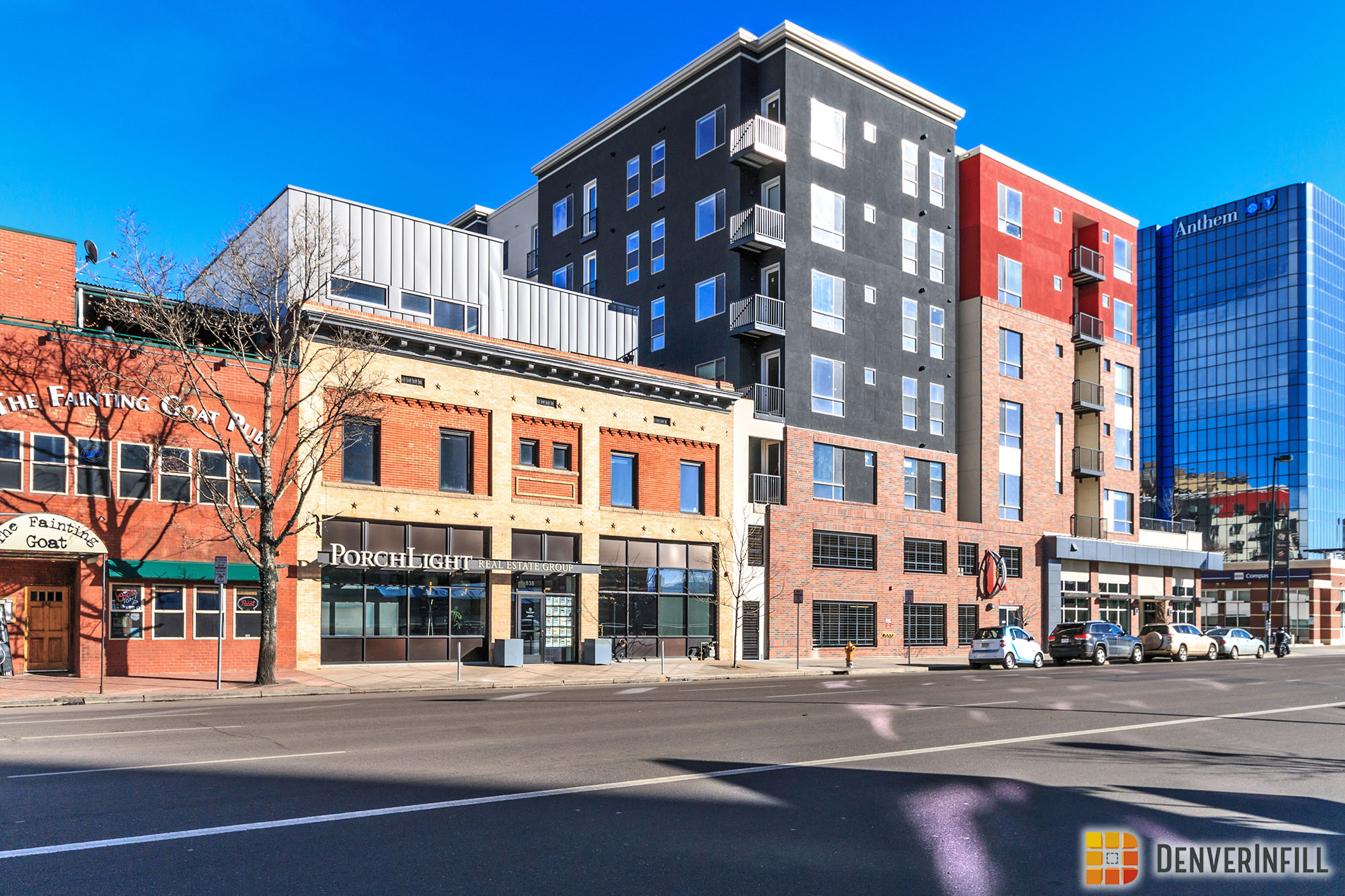
Because of the existing retail on site, Via is an L shaped project; wrapping around the bank fronting 8th Avenue and Broadway.


On the Lincoln side, this project is pushed right up to the property line creating a great street level experience. As far as the facade materials are concerned, there is quite a bit going on. Black, red, and white stucco with brick mixed in definitely makes Via stand out in this part of the Golden Triangle.


That’s a wrap on all of the major infill going up in the Golden Triangle. Have a great weekend!


What a disappointing building for such a prominent location. The original high rise planned for that space back in the day would have been great.
C’est la vie.
I like the multi-colored brick, but not that much stucco of three different colors. The cornices, while plain and simple, are a nice touch. More new buildings, such as anything being built in LoDo, should include them. I really like how the wall on Broadway was build right up to the wall of the historic building. Overall, a decent filler building.
Is there ground-floor retail on the Broadway side too?
I like what this project does from an urban design perspective. It creates a nice street wall on both Broadway and Lincoln, and removes a surface parking lot. (not as good as the proposed highrise, but still good).
But it is highly disappointing in so many other ways.
The materials – are obviously VEd to be a cheap as possible.
Even with inexpensive materials though, the design choices and execution of those materials is really amature.
For instance, in the first and second images, look at the brick at levels 2-4 under the red stucco. It doesn’t even return back to create that ‘heavier’ feel that masonry wants. The veneer just simply ends. It’s piss poor detailing and a real eyesore. The architect should know better. There are numerous other examples of this throughout this project. In the fifth image, look at how the masonry veneer just ends at the balcony. Yikes! Terrible detailing. In the sixth image, look at how flat the masonry feels at the second and third floors.
The in-plane, stucco color changes are equally as terrible.
Honestly the best part of the building is where they tried to do less – the north facade. Black and white, simple massing changes, and a clean material palette. It is clean,non-fussy and works well.
The developer drove down the budget to meet a proforma, no doubt. This results in a cheap material palette. But even with this cheap material palette, the architect did a miserable job executing the details in order to maximize the project’s potential.
Would you mind linking to photos of a recently built structure that you like? I don’t really know anything about architecture or aesthetics, so when I look at this, I think, “Eh, seems fine.” What should I be looking for?
Andy.
Here are two projects that have been recently completed in Denver. Joule and Casey.
Both are primarily brick veneer, and stucco (same as Via). However, in both cases the execution is far superior.
For Joule, look at how the brick has depth, it returns back to the building rather than simply terminating at the face (as with Via). As for the stucco, no unnecessary color changes, just treating a simple, clean volume as such. The simplicity of materials and the quality of execution makes this far more successful than Via. (the main caveat here is that the budget of Joule is obviously higher than that of Via).
https://denverinfill.com/2016/02/golden-triangle-joule-final-update.html
For Casey, the same concepts apply. Look at how material changes happen where there are massing changes. Whereas with the Via, the material changes are arbitrary and happen ‘in-plane’. The Casey’s brick volumes have depth, returning back to the building. As opposed to Via, the Casey makes the most of an inexpensive material palette, resulting in a refined quality building.
https://denverinfill.com/2015/11/prospect-the-casey-final-update.html
These buildings are not perfect either (is any building ever perfect?), but are vastly superior to Via.
I hope this helps you understand the rational for my criticism of Via, and how to better evaluate the built environment you inhabit.
Thank you so much for taking the time to explain your initial comments about this building! Far too many people just post that they hate something and never give a good argument to back their position. I have to agree with you as well that this building is just terrible in design. It almost makes the Beauvallon look beautiful! Regardless, this is another parking lot gone. It will add more residents to this area and there is some retail–just not a whole lot. It will work for now and in a few years this will probably become a more affordable rent option for the city.
Thanks for doing this. Very helpful, and I really appreciate it.
Ditto to Rob and Andy! Enjoyed your commentary.
Good critiques, Citizen Kane. Although I don’t particularly like all of the Douglas, I consider this section of facade one of the best in Denver:
https://denverinfill.com/wp-content/uploads/2014/02/2014-02-25_TheDouglas-03.jpg
It creates a very interesting look on an otherwise simple facade, and lacks the arbitrary material changes you mention above.
I think the brick pattern on the Douglas saved it from being an extremely boring building to just a boring building. I think it shows that just a little creativity can go a long way and not be prohibitively expensive.
I completely agree and thank you for pointing out WHY you don’t like parts of this building.
I’ll add a third to that. I recently commented on a former post that I’d appreciate more detailed, rational, and objective criticism from commenters. This is exactly what I see here, and for what it’s worth, I largely agree with everything you’re saying!
That said, I actually think the urban context of the structure works pretty darn well. The Broadway street wall is VASTLY improved, even if the building is a bit ugly. I like the way the retail component actually kind-of matches the pad bank on the corner too, and I also like the new configuration of the alley. I’m curious what this means from a site planning standpoint if that bank ever redevelops, but I guess time will tell.
I would just like to also add that you really hit the nail on the head with your evaluation.
I guess it’s only marginally better than a parking lot.
I agree with the criticisms above. It’s rare the rendering looks better than the final build. It’s a woefully underutilized lot / plan, with too little retail and what looks like really no consideration for the pedestrian experience. It all looks a bit confused and overdone.
The most unfortunate part is the way they dealt with the lot the bank sits on… it’s too bad they couldn’t take that corner.
People ask about affordable housing in Denver. This is the future affordable housing. Given the quality of the build and the plain banality of the structure, I predict in 5 years this place will be deeply discounting its units to keep them full.
Even then, many will prefer the historical coolness of nearby Poet’s Row type structures to the shoddiness of this “insta-build” project from 2016.
I agree. I am sure this building isn’t on the first page of the architect’s portfolio. this building’s design is already dated and with the amount of brightly colored synthetic stucco I think it will age very badly. I see the red and black stucco quickly becoming sun faded. I do applaud them for going with a bolder color palette than most developers, though. If anything, they should have used metal panel siding instead of so much EIFS stucco. I do think this is a tough site to develop, located between 2 of the busiest streets in Denver. I personally wouldn’t want to live at this location. I am glad this property has been developed, however, and it will fill the need for moderately priced apartments in the future. It is like the scores of ugly, cheaply made 1970’s era apartment buildings in Capitol Hill and in every city that fill the need for affordable housing.
They had a sign up advertising how pet friendly it is.
Can you imagine having a dog in this location? It’s like dog prison, a concrete island this insular location.
Better than a surface parking lot though. Just don’t see a lot of people saying, “I want to live in THAT building.” Turnover rate will be huge.