

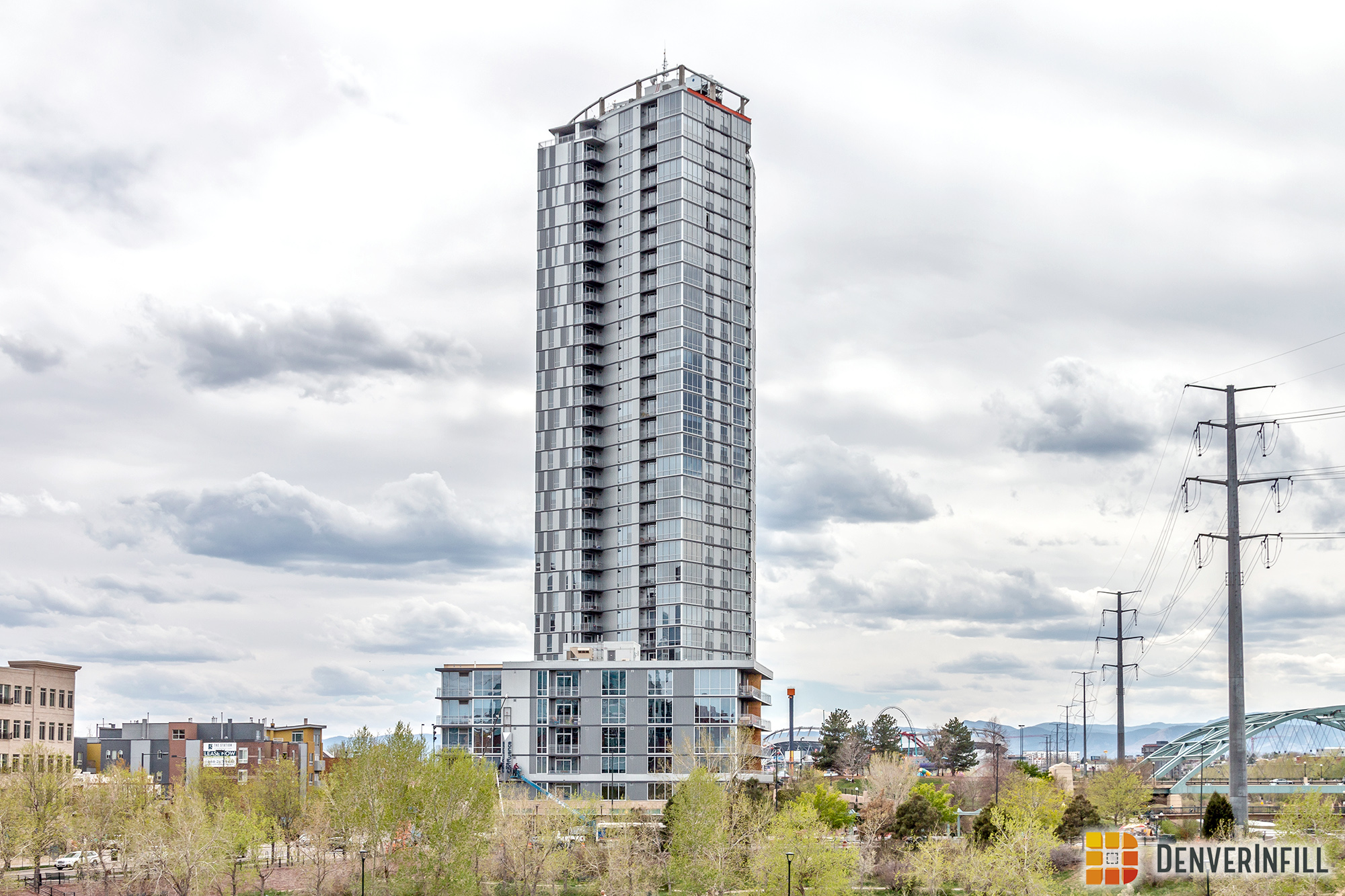
Another major tower is beginning to wrap up construction in Downtown Denver. The Confluence, a 34-story, 288-unit apartment building, is receiving its final touches, with residents starting to move into the tower. Believe it or not, the legacy of this tower began back in 2007 when the parcel was going through the rezoning process. Then, in 2010, the first concepts came out with preliminary plans to build a 30+ story building. From 2013 to present day, we covered the official project with 16 updates. Click the link below to view all of DenverInfill’s coverage.
First, let’s start by taking a look at the project from Commons Park where the tower features a more slender profile. In addition, the six-story portion of the project, fronting 15th Street, is visible from here.

Before we get to other views of the tower, let’s move in closer and check out the street level. The 6 and 34-story portions of the project are connected via bridge which also contains the outdoor amenity deck. Over the weekend, workers were installing a sign along 15th Street.

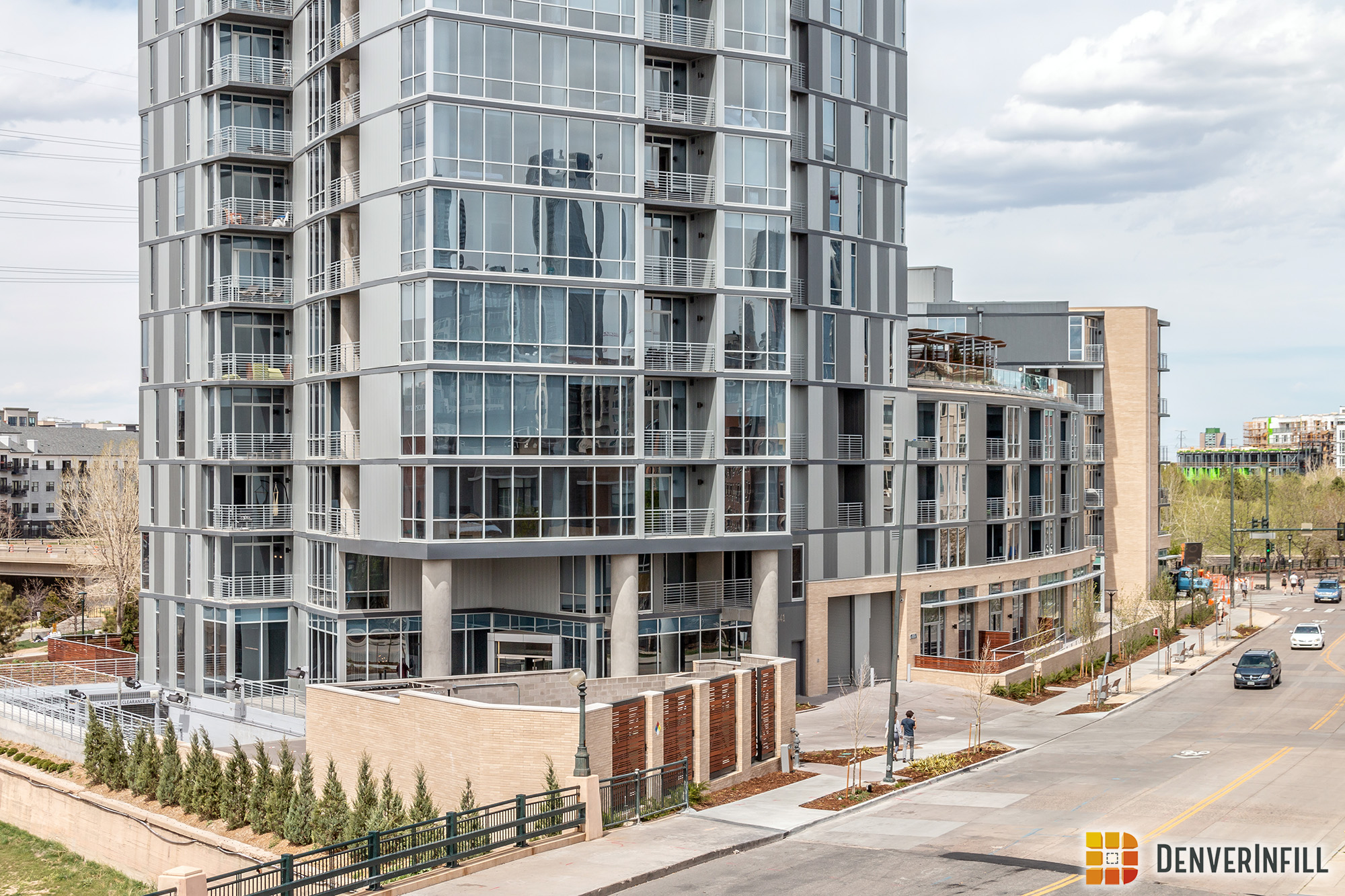
The six-story portion of the project will contain ground floor retail with some of the space facing Confluence Park. The Confluence integrates nicely with the park with open windows, great landscaping and an overall pedestrian friendly feel.


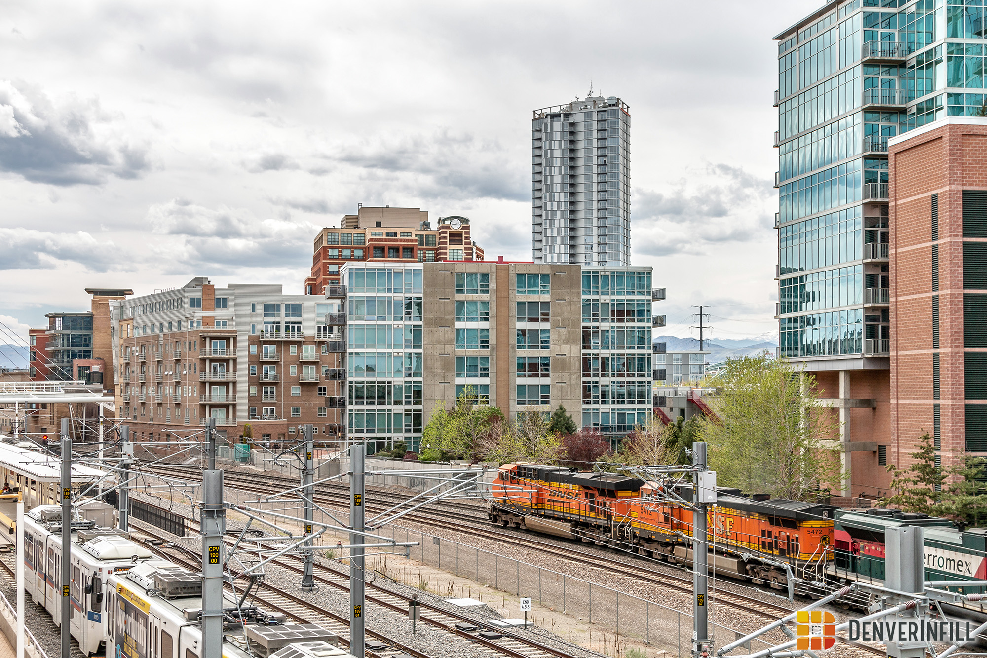
When viewing The Confluence from different angles, the varying shapes of the tower start to show. Here are four different perspectives of the 34-story tower from around the Central Platte Valley, and Union Station.


Last but not least, here is one final view of the tower taken from Jefferson Park.

There are two elements of this project that still need to happen however, we are considering this project complete due to the building being completely open and residents already starting to live in it. We will swing back around for an addendum to this final update once the roof is enclosed and the exterior lighting is permanently lit. For now, we would like to welcome The Confluence to Downtown Denver!


Last week for two nights the Confluence had a great exterior lighting system running the full length of the building on two sides. What happen to those lights and are they coming back? I have the same question for the exterior lights on 1144 15th.
I’d also like to know about this. I saw them testing a couple months ago (red at that time), and with the exception of a few nights this week haven’t seen them again. Same with 1144 15th… I saw lights up the side of the building maybe 2-3 times late last year, and then NOTHING. For scrapping the crown lighting which would have been AWESOME, they sure haven’t wowed in any other lighting design… or at least turned them on.
I think the building has a few nice angles but I’m not too fond of the overall design. The building looks like a soda can looking from the south and west and the material looks a little cheap when viewing it up close at the confluence. The facade looks a little too mismatched by the Cherry Creek trail and seems out of place for that area. Simply a different roof style on the building would have given it more character in my opinion.
I agree, Devin. Confluence Park is the city’s birthplace and deserves much better design and materials. It’s a shame that the city allowed such tacky paneling to be used on this project. What could have been a great statement building for the city ended up as a terrible eyesore.
Rob, email the city planning board with concerns of future projects. They do read the emails and respond. How influential one person emailing is, is probably negligible, but it’s worth a shot. I wish I had complained about this one. It might be possible to create/sign a petition on the Colorado government website in the future too.
I think this building looks great. High-rise – check, ground floor retail – check, attractive pedestrian level design – check, well designed landscape – check, interesting lighting – check. I also like the various angles the tower has, which changes the overall look as you move around it. Some people don’t like the tower’s height since it makes it stick out but I think it looks good and like how the massing steps down towards the park. Also, as more tall towers are constructed in the future (Elictches and Pepsi Center), it won’t look so isolated.
Are we placing bets on wether the crown actually happens? Wouldn’t be surprised if the LED system gets abandoned as well.
Those are fair points, Ken. I agree that the building is successful from a pedestrian perspective, and it’s a great place for high rise apartments. At the end of the day, it’s the aesthetic choice of those panels, and especially the checkered ones, that I’m still struggling with as a resident of the neighborhood who sees the building every day. I see the flowing water metaphor that the panels and lighting are getting at, but for me, the panels do not work. NYC’s One57 tower has a similar concept, but the choice of using checkered glass I think works a lot better for accomplishing the visual effect that they’re going for. Hopefully when they finish the crown at the Confluence, that will help the overall appearance.
I think you mean Ryan, the author of the post. But I totally agree with you about the panels. My biggest complaint about the project is the apparent quality and visual appeal of the gray panels. They don’t read as very high quality.
I really like it. Even enjoying the color selection and overall design. Especially on clear days which we fortunately get a lot of. It unfortunately disappears into the background some on cloudy gray days. And yesterday they finally started installing the crown’s paneling to go around (and screen from most views) those atrocious rooftop mechanical units. The building has had an incomplete look to it these last several months. Hopefully here soon they’ll turn the vertical night lighting on for good. Has been cool seeing them test it.
This is probably the ugliest building of its size to be constructed in this most recent push of development. I had a friend in town from Germany who remarked that it looked like a building that would be built after the war as a place to just house people. It looks cheap and I will be curious to see how it holds up over time. There is nothing contextual or architecturally interesting about it whatsoever, which is a shame given the amazing plot of land it sits on. The people who approved it should be ashamed of themselves. I truly hope that there is no illuminated crown. We already do enough to pollute the night sky with light.
I think the building is fine. I also don’t know what the talk is about the cheap gray panels. They don’t look cheap at all. I like the look. Fortunately, they’re not beige stucco panels.
*architect/stakeholder leaves comment without naming themselves*
I am not a stakeholder and my career choice is irrelevant. I just happen to disagree with all the commenters about a material that is perfectly fine. As you can see there are also others who agree with me. What a concept different opinions.
If I were the architect on this project, I wouldn’t leave my name either.
I HAVE NOTHING TO DO WITH THIS BUILDING!!! Too bad that this blog has degraded to a place for trolls. I wish that people could actually say something positive about a building without being castigated.
Agreed – Denverinfill is becoming Facebook 2.0 …
No it is not. Commenters here do a good job of self-policing but I do intervene when I think a line has been crossed.
Says the guy who obviously has something to do with this building.
Let me just say that I am a big fan of infill developments and enjoy Denver Infill and its great work. This project however is just so wrong in so many ways, it makes me upset every time I am in Confluence Park. Specifically, when you are on the bridge or pathway, you now look at this giant wall instead of a picturesque view of the downtown skyline. During the afternoon, the building reflects the sun causing glare all over the park. Instead of seeing the skyline glow from the setting sun, you now get reflective glare and no view of the skyline. As I have said before, this ‘in-your-face’ development is a tragedy for the park. There is no sound reason to have placed a high-rise here, especially when all of the other neighboring buildings are 4-5 stories. As one commenter pointed out above, this park is Denver’s birthplace. The city should have known better and should have condemned the land and made it a part of the park. Instead, their greedy eyes saw more tax revenue. On the 150th anniversary of the Sand Creek Massacre, this site should have been made into a monument to the native American people who lost their lives in the massacre that was organized near this location. Instead, we have a hideous reflective wall to look at that gives a privileged few who rent there a great view at the cost of the countless visitors who should have the view and a should have a bigger park. This is so sad and I am very disappointed in this development.
The end effect is not too bad in my opinion, and at least adds vertical interest along the Speer corridor. The panels do look a bit cheap, however, and invariably invoke the (gulp) Grenfel Tower disaster to me. I can’t imagine the paneling used for the Confluence would contribute a similar risk, but I suspect a different cladding decision would be made if the Confluence was designed today.
I agree that there’s nothing cheap looking about the gray panels. Speaking about “giant walls” the previous poster needs to check out the recent big buildings near Downing and Speer to see a really “giant wall.”
Ed, I am not sure what your point is but yes, I am familiar with the Country Club towers development. If you look around, there are giant walls all over the place – so what? My comments about Confluence pertain to its placement and the way it reflects light and creates glare. It wouldn’t bother me if they built it somewhere else, away from one of the most significant sites in Denver. This building has ruined the park. My opinion.
Is there a reason why those ugly panel walls were placed there? I assume most of the units have great views of the city so it seems odd that they’d choose to forgo valuable window space. I can understand huge blank walls built in anticipation of immediately adjacent projects but that doesn’t seem to apply here.
Hopefully those panels are as cheap as they look, then maybe they’ll invest in a different material after the first hailstorm.
There are things that I do like and things that I don’t like about this building. I like the lower level curves and massing. I like the walk through opening at street level which helps break the mass up. I like that the tower is set back from the street corner. I don’t even mind the quasi industrial aesthetic. I agree the checkerboard panels are a bit cheap looking, not because they are panels but because the pattern is oh-so trendy and looks like they didn’t have enough of one color. The pattern called attention to the building in the wrong way. I like that it is not a dark color and that it has a lot of glass and some balconies. I don’t even mind it’s height but wish it had more vertical accents and had a more slender appearance. My eye does not know how to move across this building. I wish it had sublties rather then blandness. I really hope to see the top finished.
Very much a disappointment. Should have been a trophy building at a trophy site. Far short of that. The side paneling reminds me of the materials my dad used for our back yard tool shed he bought from Sears for $120.
Oh, what could have been.
The renderings were much better for this building than the final project. What a shame.