
The Coloradan, Union Station’s only condo building, has been complete for a few months and while this update may seem a bit overdue, many finishing touches have been taking place that make this project now 100% complete. We visited The Coloradan multiple times over the past three years. Head on over to the link below to follow the project from announcement and through all phases of construction.
While there is still a massive condo shortage in Downtown Denver, The Coloradan helps fill that gap with 334 for-sale units. Proving demand and popularity, not to mention a great location, there is only one condo left for sale.
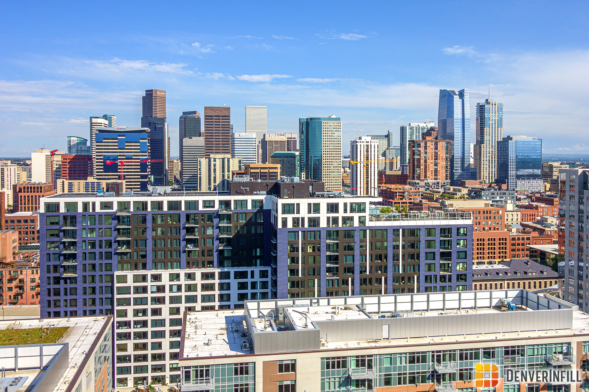
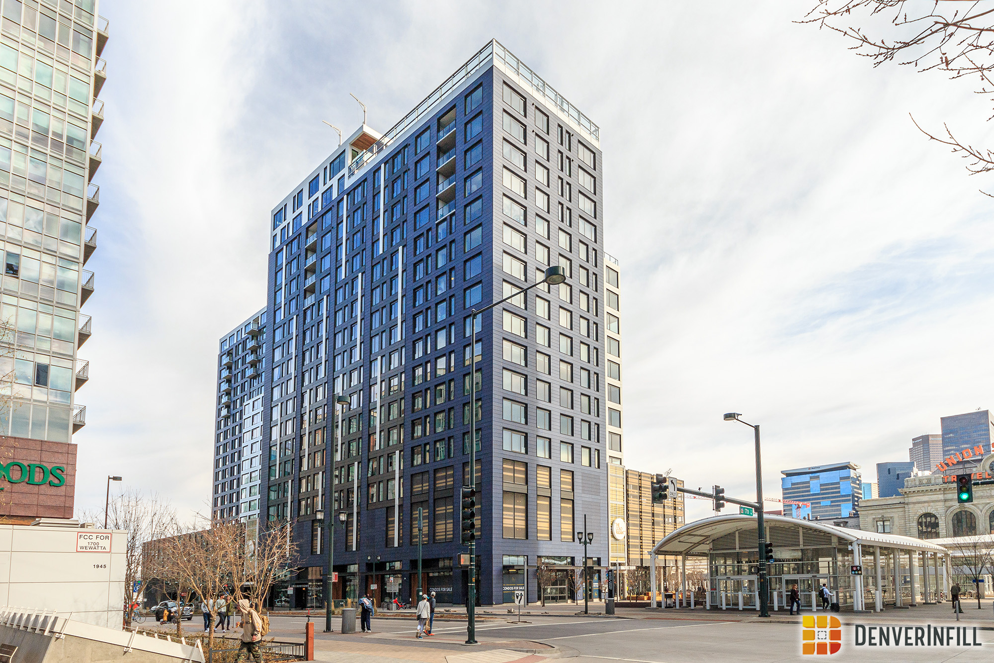
Now to the pictures. As we saw in our last construction update, the purple terracotta adds a splash of color to the local skyline. Here are a few photos from around Union Station and a close up of the facade.


When in direct sunlight, you can spot the grey and white accents mixed in with the purple terracotta. As a side note, there is one picture mixed in from the summer however, the building in that photo is identical to what it is today.
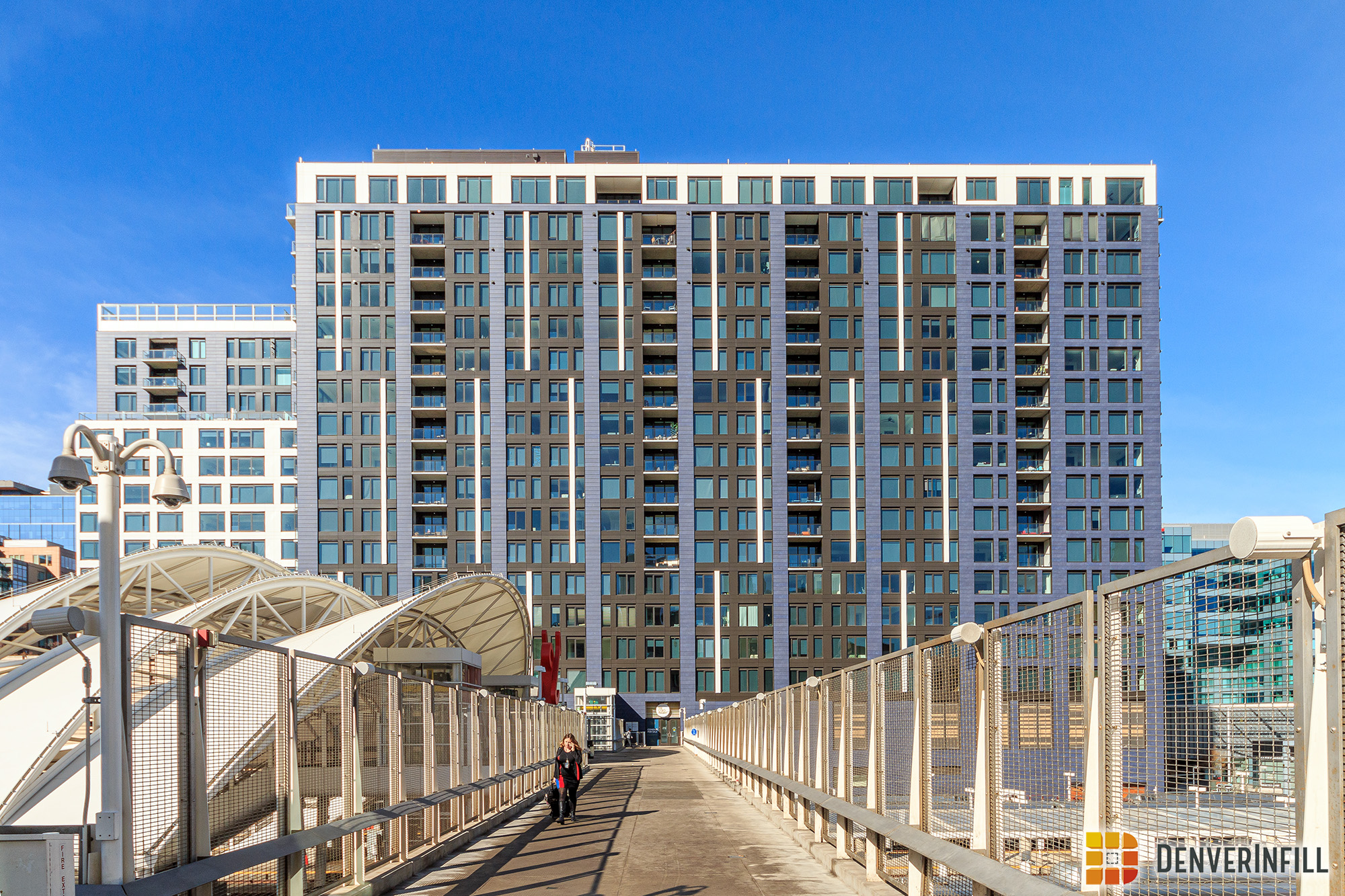


Wrapping up with the 360 degree exterior tour, here are some final photos along Wewatta where The Coloradan contributes nicely to the Wewatta Street canyon.


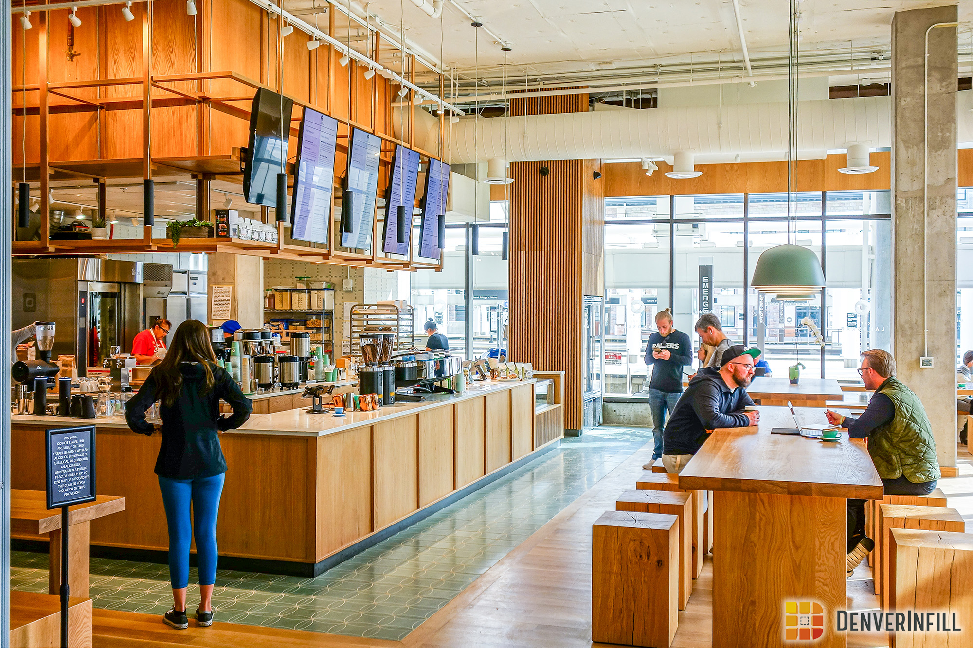
In terms of ground floor retail, all but one space is filled, and it looks like it will be filled soon. One of the brand new spaces, Cafe Landskap, has a great outdoor patio adjacent to the commuter rail canopy.


When headed inside, you are greeted with an interior retail mall and Union Hall, an 1,800 square foot space for arts and culture functions. The resident lobby resides on the second floor with a brilliant string art piece by Ines Esnal hanging from the ceiling. Below are the last set of photos in our post focusing on the interior of The Coloradan.


We are glad to see new condos in the Union Station neighborhood and around Downtown Denver in general. With only two unclaimed parcels left in Union Station, it would be great to see at least one of those go for another for-sale residential project. Welcome to Union Station, The Coloradan!


How much are units? Do you know if any are available?
“Proving demand and popularity, not to mention a great location, there is only one condo left for sale”
Hey Karl – we’re down to the final developer residence available for sale. And there are currently 18 resales available, ranging from Studios to Three-Bedrooms. Please shoot me a note Brad@TheColoradan.com if you’d like to learn more.
I have family that live here and it is a very nice building. The first floor used to be a bit confusing to find the front desk, but improved signage has been added. It looks better in reality than its initial drawings with the high quality terracotta. You can really tell the difference between condo grade and apartment grade. Unlike the Confluence building facade that is cheap looking and could have been so much better.
Could someone explain to me why they think this looks expensive and the Confluence looks cheap? If anything, the white panels running vertically down the sides of the Coloradan are distracting and break up the facade in an unpleasant way (for me). And it’s boxy as hell. But the Confluence is a cleverly water-inspired skyscraper. I like both buildings and have no idea what elements make something look “cheap.” Just trying to improve my eye for architecture!
For me, seeing them up close, in person, makes a big difference. When you’re standing across the street from Confluence, looking up at it, the facade material looks very thin and cheap. You can just tell looking at it that it’s flimsy and bends easily. “Cheap” is the first word that comes to mind when I see it. From a distance however, I really like it. It seems many people who comment here don’t, but I do.
Same goes for Coloradan. Seeing it up close makes a big difference – except in this case it looks better in person. Pictures don’t do it justice, IMO. The terracotta looks fantastic up close. You can just tell it’s not cheap. One odd thing is that in person, it reflects some light – almost like there’s some sort of varnish on it (for lack of a better word), while in pictures it ends up looking sort of dull.
I know very little about architecture, but just thought I’d offer an opinion, even if it isn’t a particularly valuable one. Who knows, maybe the thin, tinny look of the facade material on The Confluence was actually intentional as it’s supposed to mimic ripples in water or something weird like that. (shrug)
The siding on the Confluence looks like the type of cheap plastic sheets that slide into pre-installed frames. Something akin to ceiling panels in an office building. I don’t know what the material actually is or how it’s installed but that’s how it reads. The Coloradan looks expensive because it’s seems to be fully clad in masonry, a material that’s proved timeless in the architecture of the area. For all I know, the Confluence’s panels could be made of imported stone and the Coloradan’s facade will crumble in the next hail storm, but the impression they give is very distinct in my opinion.
The facade looks cheap on the Confluence . It would have looked much better with more glass and better cladding. I am pointing out the difference between condo grade and apartment grade.
Cheap as cheap is compared to….? Maybe if Brooks Towers was duplicated and a condo building at the confluence. I don’t think this comparison is strong for comparing. I like the Confluence, maybe yes maybe no it could have been done better but I like it being the difference in the area how it stretches that comfortable eye lifting the urban environment to, yes it’s a big city not overly trying to be a big Vail where you ski into town, ha!
That’s one amazing contribution to the urban environment. Usually I don’t like the sideways density all that much as tall slender but this one was done well in every way. I like how the windows jux. I like the white lines keeping it mod. Crit would be space some closer in clusters and some the usual synch. And speaking to what is today’s contemporary architecture this is done well. I do think matching this with a second tower that’s taller and slender would enhance the visual experience of the area rather than all the ‘general height’ of the buildings in the area going for that European appeal or historic Denver 1930 won’t work as well simply for the fact that the historic value can’t be repeated with today’s cost of materials.