
The moment many of us have been waiting for has arrived. Westfield Development has just officially announced that Xcel Energy has agreed to lease approximately 350,000 square feet of 1800 Larimer’s total 500,000 square feet.
Site prep work has been taking place at the 18th and Larimer location on Block 066 for several months now, but until today Westfield had not made any official acknowledgement that construction had started. With today’s announcement, it will be full-steam ahead for 1800 Larimer toward its 2010 completion.
Here’s the full press release issued moments ago by Westfield: 1800 Larimer Press Release and in case you haven’t seen the rendering lately, here’s what the 22-story tower will look like:
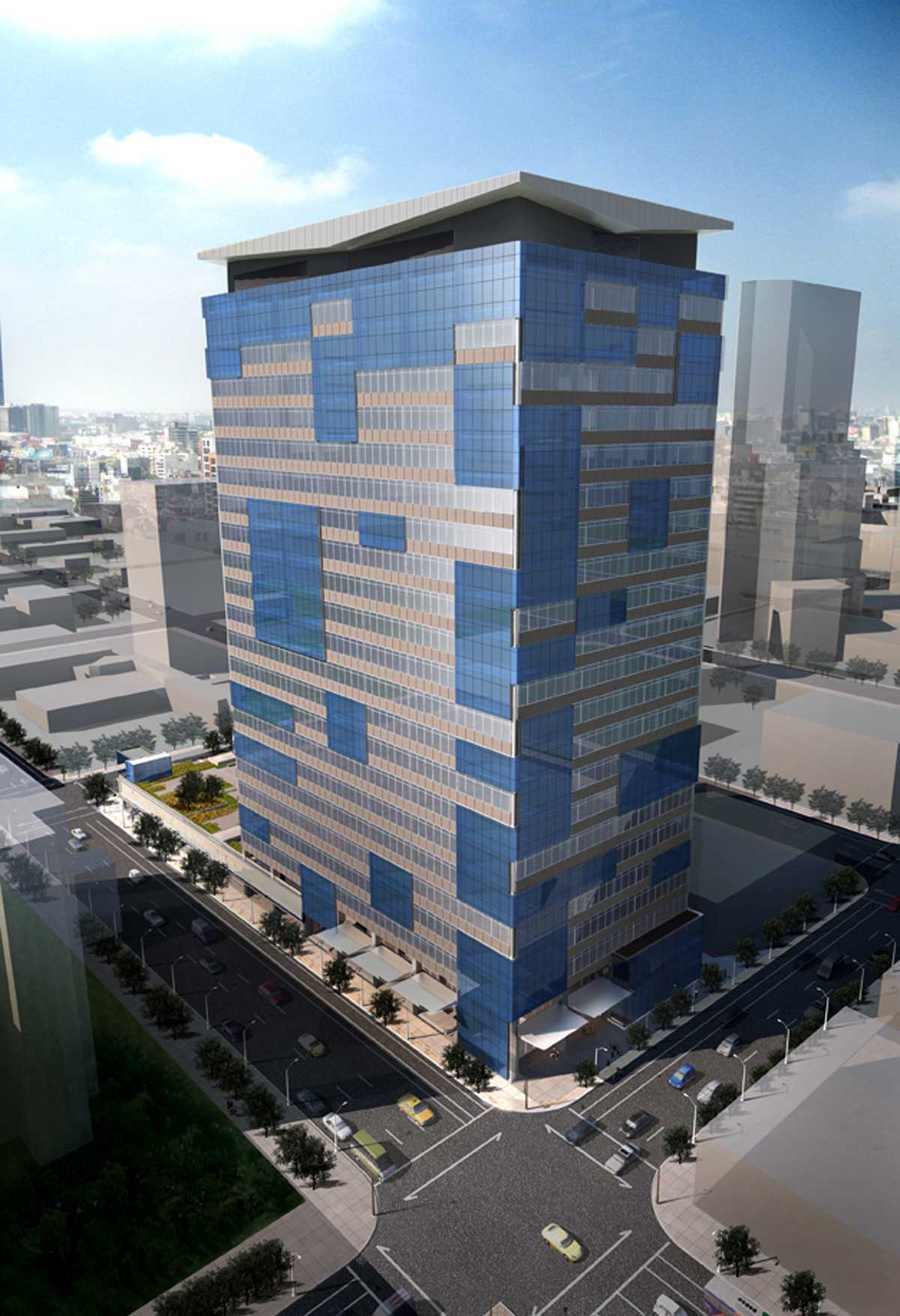
1800 Larimer has been pre-certified as LEED Platinum and will be one of the city’s most green/energy-efficient buildings.
We now officially have a 22-story building under construction to join the Four Seasons, Spire, and our other high-rises in the works.
Congratulations, Westfield!


yeaaaaaaa!!! buildings, buildings,
buildings.. oh ya and more buildings…Cos
Great to see this project moving forward.
Although I'm glad this is moving forward, I really dislike the design of this building. With that said, I've been wrong before (see: Sugar 3), so hopefully I'll be wrong again.
I think this will look amazing at night though — it'll be cool to see how the Tetrisitude of the windows during the daytime gets amplified by lights in the building being sporadically on and off at night.
Did I read that right — this building will have a steel frame? By the way, I am very excited about this building. It will make a huge impact on the skyline driving in from the north. This building's LEED Platinum standard is yet another step toward making Denver the renewable energy capital of the US.
Testrisitude? Seriously? Don't make up words.
BTW, this building sucks, testrisitude or not. Congratulations Denver, on continuing the habit of approving designs that degrade our city. Maybe you should start thinking long-term. For $384/SF you'd think the building should be a knock-out.
Very disappointed. Horrible addition to skyline. It's a 1980's box with a cheap disguise. Horribe for the streetlevel activity. No housing in an area that desparately needs it. Horrible for hopes of a brighter future on that block. Perhaps the worst news ever posted on this site.
This building will look amazing when it is completed. I like the sporadic placement of the blue windows and the top will look amazing when lit at night. And anon 10:42, why does this particular area need housing? There are plenty of lots still available to the north in Arapahoe Square for housing. As for street level activity, this building is a huge improvement over the crappy 2 story medical building that used to be there. I get tired of arm chair architects criticizing everything as if they could do such a better job of designing everything.
Does anyone know what the status is of 1800 Market? That stretch of Market is such an eyesore. I am not sure how attractive it is for housing, however. The 1900 block of Market gets pretty rowdy every weekend.
I'm not a huge fan of the crossword puzzle effect – but it may fit in the the current crop of public artworks around town – giant chairs, big blue bears, etc. For visual appeal, I'd prefer that the entire building be clad in the blue glass panels – but it's not my building or my buck building it. So, I understand the dismay of anon 9:41 and anon 10:42, but their comments might be a bit melodramatic – this is just one building that will help fill in and hopefully energize an otherwise dead area and also hopefully help to stimulate further development. And it's 22 story profile will not even have that dramatic of an impact on the skyline. We can hope that some day, this building will be surrounded by taller, more magnificent buildings and be remarkable only for it's progressive LEED credentials. But for now – build away!
Hey Ken – a little off subject of this building, but yesterday I noticed that a construction trailer, portable bathroom & generator were all set down at the Embassy Suits site. Don't know exactly what that is about, but could be good news – may want to check that out.
Joe
I am interested to see how this one turns out, but I by no means think it "degrades the city". The first new office tower in 20+ years should be cause for celebration, and the LEED Platinium is great!
Anonymous said:
Tetrisitude? Seriously? Don't make up words.
I like it. It's a perfectly cromulent word.
Well I wish it was 36 stories or 400 + Feet. but I'll take it it should be cool with 1401 Lawerance and Tabor II going up in the same general area.
It is just me, me is that one ugly building?! Surely Denver can do better than that!
What a gorgeous building. It truly embiggens the city. Go Denver! And don't pay attention to those crumb bums bashing the building design. They probably don't even live near downtown Denver. They sound more like Shelbyvillians to me.
Here we go again…
To those wondering about the building's impact on the skyline:
1800 Larimer will be 22 stories, but it has larger high-ceiling floorplates that make the overall height 347 feet tall. Think a bit taller than Larimer Place (329 ft), but shorter than the new One Lincoln Park (380 ft).
It will look great! (sound Tetris music) 🙂
Yeh anon 5:47, same crap! At this point, I am no longer reading comments posted on this blog. It is ALWAYS the same arm chair architect garbage. Thanks Ken for the awesome updates to the blog and to your website, as always!
This is a cool building! It’s modern and daring for a City like Denver,
anyone who says otherwise is stuck in the past and quite frankly and idiot!
@Anonymous 6:24:
I like the comments on the blog.
I just wish more people would use a blogger/google account to post messages because then they'd be a little bit more respectful due to the lack of anonymity. I often catch myself from saying rude things, simply because my name is next to my posts. It's a lot harder to call people idiots when they know who you are. 🙂
Anon 9:41, he said "tetrisitude" not "testrisitude". You obviously didn't get the reference to Tetris, which is what this building evokes to most people. And I think it's fun just for that fact. Not to mention, the interior lobby renderings looked pretty sweet. And it's not a square top either. So kudos for that.
As for Joe's comment, I noticed the trailer and the portapotty at the Embassy Suites site at 14th and Stout too. Anyone know what that's about?
In defense of armchair architects: for every licensed professional who made it through architecture school and managed to land a job in their chosen profession, there are probably ten others who love architecture as an art, who perhaps thought seriously about getting an architecture degree, or who got one but couldn't manage to find a job in what is a fairly small profession, numbers-wise. I am one of those who seriously considered it, and was even accepted into three different programs, but who decided, based on the economy at the time, that I'd never land a job (cowardly, maybe, but that's how it was, and my parents were not wealthy-I had to support myself). So when a wonderful website like this comes along, we use it as a forum for discussion about the relative merits of the buildings getting constructed in our city. Yes, we're somewhat ignorant of architectural history and all of the latest trends, and we don't know how much architects have to compromise with their clients and communities, and we're judging unbuilt structures based on renderings rather than the built results (a bad idea-no building ever looks exactly like its rendering). And yes, Ken has said repeatedly that this isn't an architectural website per se, but is instead meant to chronicle the overall improvement in downtown's built environment, still, with all of these renderings being a part of the website, the temptation to make a comment is irresistible to a lot of people.
When this design was first unveiled I didn't like it. I still don't, but I'm willing to see it built and judge the actual building, not this rendering, especially since its devotion to being green is very laudable. And this building will do something positive: from the north it will block views of the Windsor, one of the ugliest things ever built in Downtown Denver.
How could you hate this building? I think it is quite cool and will look even better than the rendering when completed. It just takes some getting used to. Good job RNL Design!
For people who are commenting on the shape of this building, you're completely missing the point. Thank God you aren't architectual engineers. The glass work is clearly the emphasis on this building and makes it very progressive. Not to mention this mixed in with all of our heinous brown buildings will give downtown Denver a very dynamic look. On rainy days and snowy days, 1401 Lawrence, 1800 Larimer and the buildings that compose the Union Station plan will give Denver a very interesting look and feel.
Uh, saying you like a building is every bit as much "armchair architecture" as saying you don't like it. Unless your position is that people who live in cities should not have opinions about the buildings in them (in which case why are you here in the first place?) then the position that people shouldn't comment is completely absurd, and overtly hypocritical.
I think this building sucks. Sucks sucks sucks. If you disagree with me then more power to you, but don't tell me your opinion is valid and mine is invalid as "armchair architecture". If yours is valid then so is mine, and if mine's not then neither is yours.
beyonddc what did you want them to do with this building? Seriously, think about it. Their budget gave them 22 stories and they wanted a green top. What, did you want them to build a pyramid or something? With a 22 storey limit its very practical to put emphasis on the glass work and considering that the roof has to be flat for a green top, I think the top is very agreeable. You're getting bent out of shape over a 22 floor building trying to be space conscious. Please, being the architectual critic/guru you are, give us a link of a 22 storey building that meets your standards. I'm dying to see it.
John, there is more to architecture – way more – than the basic geometric shape of a building. For a much more attractive mid-rise building, look no further than three blog posts above this one. Even if you were to flatten the roof on that building it would still be far more attractive. The architects of the 15th and Stout building took care to make sure it has attractive proportions and human-scale details, and the result is a million times better.
Ultimately I don't care that it's a box and I don't care that it has a flat roof. Virtually every historic building downtown is essentially a box with a flat roof, but something makes the cleaned-up Fontius building (which I said is "fantastic" in the thread below this one) different from this building.
I care that large brutalist glass curtain walls are hostile to pedestrians because they don't provide human-scaled details, and that the designers of this building failed with every half-hearted attempt they made to mitigate that. The randomly festooned band-aides of colored panels that pass as decoration make the building look like it has to be patched endlessly to keep it from falling down, and I like my buildings to stand up. The patching is awkward because it's trying to pass off abstract randomness on a building that is otherwise extremely formal. And while the reflective blue of the patch glass looks like it will be OK, the majority of the facade appears to be an incredibly dreary gray, like many buildings from the 50s and 60s, and what's the point of using glass in the first place if the result is dreary anyway? Further, the downward-arrow-shaped slant at the crown is awkward because it makes the top of the building look heavier than the shaft, which is the opposite of what we expect. Lastly, half the base appears to be a blank concrete slab (left side in this image), awful for pedestrian vitality.
There's a perfectly fine filler office tower here somewhere. It's not about sitting on a square site, having a flat roof, or even spending tons of money on expensive materials. It's about designing buildings with humane and graceful details rather than ironic parodies that hulk clumsily and will go out of style in 5 minutes.
I don't think you guys understand this rendering.It shows what the building would look like after a tornado hit it and several of the windows had to be boarded up. Hey, beyonddc I like you. I am not an armchair architect, I am an Architect. And I am losing respect for RNL. Davis Partnership can show you how to design an attractive box. RNL did a good job on the Spire, but a couple of their latest just BITE!!
Davis does great work. I have not seen a project of thiers that I do not like. I got to see them work up close on a project outside of Denver, and they really do put a lot of thought into thier work.
Back to the discussion, I thought the green roof was on…you know the roof. Turns out it is a terrace that sits above the first floor, so basicaly a chunk of the project is 1 maybe 2 stories…
Continuing the discussion, if you look at the video presentation on the project website there is a rendering that in my armchiar oppinion makes the building look a lot better – more of a blue/grey color than a brown/grey color. So I will reserve judgement until the project is done.
Oh, I forgot to add; RNL should be commended for the LEED Platinum. Not an easy thing to get on an office building.