
Urban Villages’ SugarCube project on Block 019 in Lower Downtown Denver, a strong contributor to Denver’s architectural palette, filled a big gap in Downtown’s urban fabric along the 16th Street Mall. To celebrate SugarCube’s recent completion, let’s take a look back at this hip LoDo project.
The first time I mentioned the SugarCube project was in my blog of October 12, 2005. Over the course of the next several months, I tracked the project as it made its way through the LoDo design review process, including a report in my April 7, 2006 blog that the developers were just one approval away from getting the green-light from the LoDo Design Review Board. In my June 30, 2006 blog, I beat the mainstream media to the punch and was the first to reveal the project rendering, thanks to Jason, Nick, and the rest of the good people at Urban Villages:

On November 8, 2006, the SugarCube held its ceremonial groundbreaking, and yours truly was there. Here’s a shot of the model that was on display at the event:

By mid-December 2006, construction was officially underway:

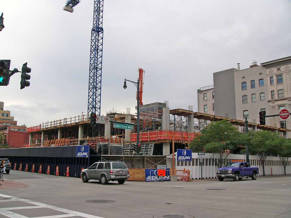
Then came the fun part: watching SugarCube go down, then up.
January 2007 – February 2007 – April 2007:


June 2007 – July 2007 – August 2007:


October 2007 – January 2008 – February 2008:

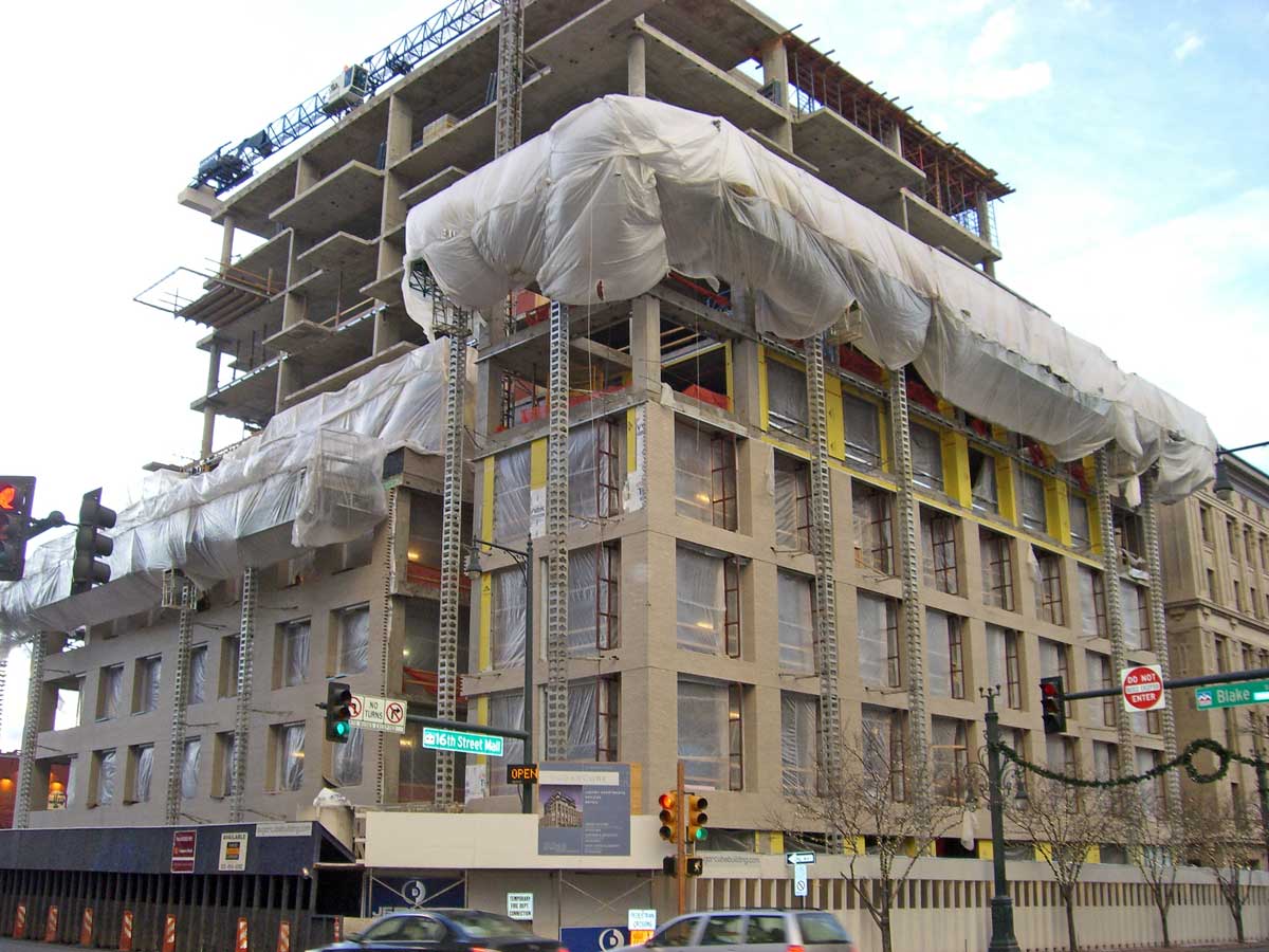

May 2008 – July 2008 – October 2008:

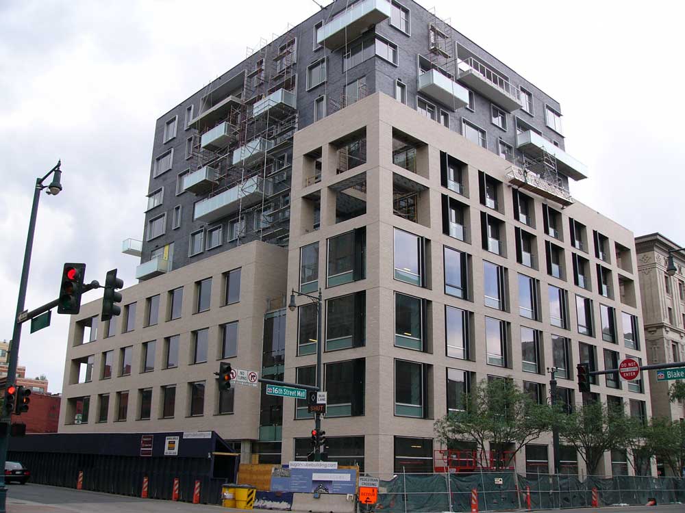

SugarCube is an outstanding addition to the LoDo scene and a perfect example of the transformative power of an urban infill project. Congratulations, SugarCube!


wow! very cool. probably my favorite low-rise project.
15 years from now (if we survive 2012) I'll be parked 20 feet above the street in my flying car, in front of this building, and exclaim, "…..WHAT WERE THEY THINKING?!"
The Sugarcube is like todays fashion….need I say more?
I disagree. No doubt the design is slightly radical, but I could see this buiding blending through time much like the other radical buidings from other cities. Like the Lloyds Building in London, or the Capitol Records Building in L.A, and others.
I agree, it is 'today's fashion', but like other eras, the fashion becomes timeless and unique over the years, even more than when the building was built. I love the cube! It will age just fine.
I agree francorey…
Does anybody look at Union Station or the surrounding buildings in LoDo and ask, "What were they thinking"?
Victorian, neo-classical and modern can all live quite happily together as long as they were designed and constructed well.
I think this building will be appreciated as a fine example of this era's architecture for decades to come.
And a flying car? that's just silly.
I'm glad somebody finally put a building at that location, but hate hate hate the architecture.
The neo-brutalist bottom is as boring as any shoebox in the city, but at least it's inoffensive. The same cannot be said for the top, which at best is a poorly executed version of 1920s-era De Stijlism, but is more likely a cheap attempt at faddish Deconstructivism that comes off as more trailerpark chic than actually classy.
In any event it's ill-placed. Abstract architecture is by definition a parody of formal architecture. "Irregularly placed features" is a design joke that relies on everyone's collective understanding of Regularly placed features to be interesting. That is to say, when your goal is to be "different", you are relient on there being something for you to be different from. Because of this reliance, for abstractism to work it has to be a highly-visible landmark location surrounded by a stylistically cohesive framework. This location has neither of those advantages, so it would be a bad fit for even a well-designed abstract building (which Sugar Cubed isn't).
In other words, this ain't no Guggenheim. Mymilehi is right.
Now Jellyneck, you're just getting carried away! I have a question for you and to anyone else: What do we call this decade?
the "Two-thousands"?
the New Millenium?
the Double O's?
the O's?
Beyonddc;
Abstract architecture is not a parody of formal architecture, its a departure from it. To look for a parody then perhaps you should go back to the 90's and have a gander at post-modernism.
"Regularity" is not solely a description of architectural features, it is a description of organization. The only dependence this description relies on, is our understanding of the english language. Beyond that I would argue that regularity isn't inherently better than irregularity, unless you are speaking of bowel movements.
I'm happy to disagree about the merits of the building, but if we are going to give little lessons, let's at least do a good job with our definitions of architectural theories.
I call it the zeds. But I'm the only one, so nobody knows what the hell I'm talking about.
I would call this decade the uh-oh decade.. because of the fear mongering.
And equally scary, just in time for halloween is this building. Sorry, I just don't like it. I think 16 is so much nicer.
I like the scale of the building itself in that location.. its perfect, but I just hate the overt homage to the big squares.. do we need to be so obvious?
jellyneck said:
>Abstract architecture is not a parody of formal architecture, its a departure from it.
I said:
>when your goal is to be "different", you are reliant on there being something for you to be different from
If you want to disagree with my usage of "regular" to describe non-abstract architecture, that's fair enough. But abstract architecture is absolutely a parody of non-abstract architecture, because the entire goal of abstract architecture is to be a departure from the non-abstract.
Without a whole lot of non-abstract buildings around, abstract buildings are utterly pointless.
In this building's defense, I will agree with Joe: the scale is right.
Nothing is "sweet" about the sugarcube, it seems;) Hope the rain dissolves it overnight!
And nothing is certain about this decade! It will definately be interesting to see what name actually sticks 15 years from now. What strange times we live in!
I think it is a great building… The brutalist base is a great foundation for the more whimsical top. the cream colored bottom is contextual with the surrounding buildings and the grey offers a great background for the irregularly spaced balconies. What I think is *most* successful though is its massing. The brick to window ratio is nearly perfect as are the setbacks which are not overly complex and still offer what must be fantastic terraces.
Frankly, I don't see what about this building is abstract. Columns, beams, windows, balconies. It has all the same "building blocks" of any other building, it just uses a different language to order them.
Though I will admit that the irregularity of the balconies and the windows on top are not as successful as they could have been. I don't want classical order or even symmetry up there, but there should at least be a sense of balance and I feel it fell a little short there.
My architectural views are a departure from yours BeyondDC, but that does not make them a parody. Like architectural styles, it only means that I make my judgements on a different set of values.
I feel like part of this project included a small infill project on Wazee behind the Cube. Is that still going to happen?
The irregular windows and balconies up top aside, Sugar3's context and scale between the more traditional buildings on either side works well.
The perspective looking down 16th street looks decent (can't say I like the Blake side nearly as much), and the whole Market Street Station area is looking worlds better than 10 years ago thanks to this building and the adjacent 16 Market Sqaure.
What's more, the next decade may hold just as much change as the previous one: there's the potential for the W hotel and the associated parcel next door to be developed, and the bus station itself will eventually be sold to a developer to help finance union station.
I think the Sugar3 building is the nicest and most sophisticated and intellectural building in Downtown Denver. It is both progressive and modern while reflecting and respecting the history of the neighborhood and its buildings.
The design and level of detail could be appreciated on many scales and levels. The clean, contemporary use of brick to the height setbacks/relationship to the original Sugar building to the playfullness of the windows and balconies of the residential levels, the Sugar3 building is definitely a positive contribution to our cityscape and I hope will set a positive precident for thoughtful building design in Denver.
Historic copies is not the only option for LoDo, as Denver is becoming a more progressive city.