
I was out of town when these renderings were released and when the ceremonial groundbreaking was held a few weeks ago, but better late than never!
Here’s the new Colorado History Museum, now under construction at 12th and Broadway. Images courtesy of Tryba Architects and the Colorado Historical Society. As always, click on the image to view in full resolution:
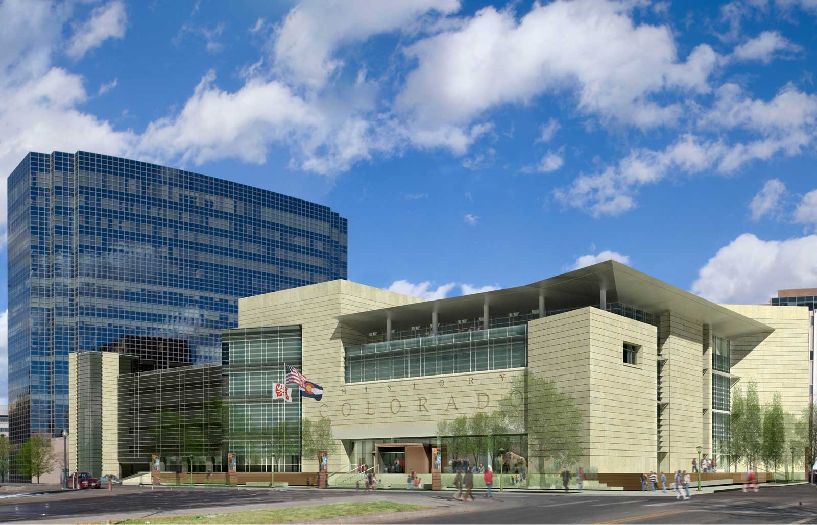
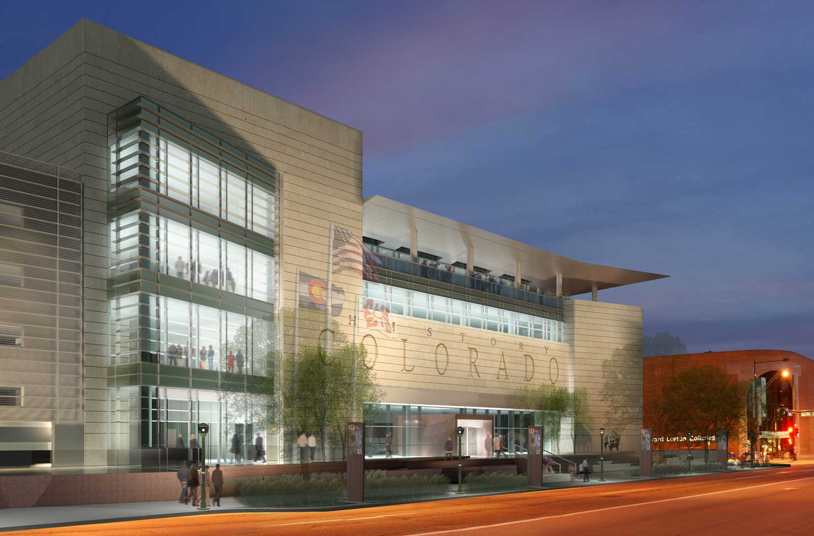
For a description of the new Colorado History Center’s building program and other details, I’ll refer you to the excellent article on this topic by Westword‘s Michael Paglia. He covered all the bases nicely.


I don't recall reading what was going to happen to the old building complex?
The Colorado Justice Center (CO Supreme Court) is taking the entire block at the current CO Historical Museum location.
It is too bad that Tryba produced such a predictable and dated design for what could have been a fantastic opportunity to do something fresh and forward feeling. Insted we get another backward looking piece of Po-Mo trying to look like proper modern architecture.
It seems that all of Denver, except a very few projects, has been stuck on stupid since Graves violated the city with his abominable Central Library.
Blah, I am disappointed by the architecture in these renderings. To me, it looks like a mix between the new court house and 1900 Sixteenth. I wish they got a little more creative with this one instead of copying the same design around.
not daring in design whatsoever. its nice enough with the glass, but the bland beige makes it pretty boring, really.
i agree.
boooring.
Why, So boring CO? come on! I can't believe the lack of creativity. I'd hate to think about how many Bureaucrats it took to just get this average building approved.
Suggestions on what you think a nicer building would look like would be appreciated instead of just ranting on how "boring it looks." Let's not just criticize but use these comment areas to really brainstorm some great ideas. I know members of the architecture community and city are listening.
I for one can see that the sandstone color facade may look boring but enjoy the steel like roof structure that reminds me a little of the convention center. The use of glass enables more natural light in which I think is a step in the right direction.
Sure this building looks relatively traditional, but I would point out that the block is in the same neighborhood as Libeskind's Art Museum and the Denver Public Library, both very non-conventional structures.
Do we want this neighborhood to look like some kind of junkyard? It doesn't help the non-conventional buildings in a neighborhood when every single building there looks like its been pried open with the Jaws of Life. You have to vary it a bit, and balance out the unconventional with the conventional.
i disagree.. while i would have much rather seen the holl design for the justice center built, there is becoming a nice continuity between all the limestone buildings in the civic center.. it allows the buildings that do "break the mold" to really pop, and furthermore, other architectural masterpieces to be built in the future will also stand out.
I'm relieved it's replacing a parking lot instead of part of Civic Center Park. I also think it's a nice counterpoint on the block to the all-glass ING building. If only the blank wall on the Broadway side of the museum residences would be finished, these blocks would actually look finished.
Can I just say that "History Colorado" sounds terribly awkward? It reminds me of "Army Strong." In English, putting adjectives directly after the object they modify is generally unattractive.
I don't necessarily think that every new building needs to stand alone on its own merit. There is something to be said about a city that has some degree of continuity. I like the fact that many of the buildings in the civic center are built of similar materials. I think the History Colorado Center incorporates the justice center and the Colorado Convention Center, with other civic buildings in the area. I often ask myself which cities stand out in my mind the most. Paris, Santa Fe, London, Amsterdam. They all have a degree of continuity amongst them. So, does the building itself lack some imagination? Yes. Does the building fit in to the context of the surrounding neighborhood? Definitely.
Zzzzzzzzzzzzz….
Boring, lame, uninspired.
Here's my suggestion, Anon 10:39; Exciting, bold, and inspired.
The problem with all these government buildings is that they will create a giant dead zone at night and do nothing to improve civic center park. The area needs more residential and commercial sprinkled throughout this area, not more block long civic structures. The Liebskind tower would be a big help in this respect.
wow!! is it just me, or is it that tryba architects designs the best buildings!!!
I agree that some type of continuity is nice, and i think the limestone facade will achieve that. However, the architecture itself leaves me disappointed. Its "ok" and does what it is suppose to, but i hold civic buildings to a higher standard. I think that should inspire the people they serve. it doesn't have to be something radical or designed by a starchitect, just not another ordinary building covered in a "modern" facade. I think if this building served another purpose somewhere else it would be quite good. just not good enough for this project.
Wow, what a lot of haters. This is a brilliant design for this site. As Pizzuti points out, not every building should scream "look at me." This one does not fade boringly into the background, however–Tryba's use of contrasting earthy/rough and slick/shiny materials gives the design a lively quality, which will only be accentuated by the deeply-recessed areas that will produce deep shadows to contrast with the brighter exposed areas. (That's a poorly-written sentence, but I don't have time to go back and fix it). I would bet money that none of the haters bothered to click on the link to Michael Paglia's article–I suggest reading it, because it gives a great explanation of why Tryba designed the building to look this way. How anyone can call this design "boring" is beyond me. Mike Brady–now that's a boring architect.
As for "History Colorado"–I completely agree with the person who said the name is awkward. I'd much prefer something more traditional, such as "Colorado History Museum." It's more straightforward, and more clear, and that's what you want on a public building. It's not too late to change the name.
it's really not that bad, looks a bit mid-century and it's better than an empty trashed out parking-lot.
We really need to bridge the wasteland presented by the Colfax, Broadway, and the park between this area and the rest of downtown. One of the park renovation proposals suggested sinking Broadway, Colfax, and 14th for several blocks. I would go further, and suggest sinking Broadway between Park Ave. and 12th, and creating a pedestrin plaza with center-line shops and attractions. Sort of like 16th St but better the second time around.
Yes, out of sight out of mind, wonderful urban elitism. Call it Pearl St squared. Maybe an art walk too?
The whole city beautiful civic center complex does not work very well in Denver or anyplace else its been tried even San Francisco. To make a neighborhood great requires a wider blend of uses, residential, commerical etc. Denver should be putting these musumems and government building in other neighborhoods in or near downtown but not all in a single use monolitic Civic Center district eg government ghetto.
I like it. When I picture a building dedicated to Colorado Histrory, for some reason I picture this. Somewhat bland, yet semi-unique and calmly appealing. I agree, it shouldn't shock and awe like so many want it to.
I also like it. It is simple, clean and it looks like a museum. It has well defined entrances and the transparent elements will add visual interest at night. I agree with the other posters that not every building needs to beg for attention. This is a strong civic design, that will compliment the surrounding area.
Way off topic, but did anyone read the article in the denverpost the other day about changing some streets around town to make things more pedestrian and bicycle friendly? Ken, you wrote about this earlier. Any chance you could get more on it?
The architecture or facade materials will mean very little in helping civic center have any life outside of working hours. The problem is that none of the civic partners want to share their sites with 'other' uses, or what we might call the varying teeth of a mixed-use neighborhood.
Civic center is now almost beyond hope (in terms of the problems), with almost every surrounding city block being a single parcel, occasionally two parcels, consisting of a single-use building, generally only open from 8am to 5pm.
The buildings are large, uniformly treated and generally not at a pedestrian scale (there is architectural diversity, but that's not what I'm talking about). If they were standing alone, like the museum in City Park, then the concept works better. Instead you get an entire neighborhood of buildings that do not relate well to the pedestrian experience, save the tourist and someone appreciating architecture.
In the end, if you live in Cap Hill, GT or downtown, you don't enjoy hanging out in this neighborhood unless you're going to one of the buildings. Traveling through provides little relief for the pedestrian, with 5 story monoliths and only a few entrances per building.
Historymystery says it all. Study what he says about the texture. Classic and nice. I love it when folks see the same "stuff" I see.
Good going Tryba.
Let me get this straight…after all these comments it appears that the definition of "good" architecture has been reduced to "it's limestone" and that it is better than "an empty trashed out parking-lot". I don't think anyone who has dissed this design were suggesting it should be some "look at me" design. All I want is for it to not be bad design.
Suggestion #1: Design in section – not just plan – to produce some spatial interest. Then, try expressing some sense of volume and internal space on the exterior of the building. This could be a suburban office building. Suggestion #2: There are so many new and exciting ways to do curtainwall these days, why not try one? The overly horizontal stripedness of this design ran out of intellectual steam in the late 1990s. Suggestion #3: Make the entrance more inviting. It is very heavy and not drawing people in. Use something better and more appealing than a 15 foot high limestone "beam" to mark the entrance. Daylight feature maybe? Suggestion #4: How about designing a building – that is ostensibly dedicated to our state's history – with design themes, forms, or ideas that have ANYTHING to do with Colorado…is that too much to ask???
hmmm… something to do with colorado, they should have made it a massive denver foursquare!
I am one of those "haters" hysterymystery referred to and I would love to take him up on his bet. I actually did read the article; which I did find interesting and I'll admit, warmed me up to the design a little bit. I would definitely not say this is a bad design, just not a really good one. I too don't want some radical piece of architecture that make a better statue. I would support what Anon 8:37 suggests. I also think that if creatively done, the Denver Four Square could have some merit. I have huge respect for Tryba and I do love several of their projects, such as the Webb Building, Clayton Lane, what they did with the Teatro, etc. It seems like they are often in the "mix" for may high profile projects and deserve to be considered. However, I do feel disappointed with their designs for this project and 1900 Sixteenth. Probably because I feel these projects are much more significant than most and deserve the best. I'll keep my fingers crossed that i will be pleasantly surprised.
Having just made it back in town from the state AIA conference I concur with the 'It's OK, but could be better crowd'. Also, the point above about it saying something more about Colorado is valid.
My thinking is going this way because of two presentations at that conference. One from the folks at IDEO and the other Bjarke Ingels and Michel Rojkind. The latter being one of the more inspiring strings of 'why not, let's try it, makes sense, why didn't I think of that, how come that doesn't happen more often' examples I've ever seen. Bold and outrageous at times? Yes. Completely logical and representative of place at others? Yes. The main message from it all was to think a little bit bigger outside of the box, don't be afraid to try and maybe something survives that is unique or referring to place. There were a few grumbles about youthful exuberance displayed by Rojkind and Ingles but they were far exceeded by the "That was pretty amazing, how do I bring that back to my practice" (also youthful exuberance. BTW Rojkind and Ingles are somewhere in their 30's) comments as well. Can it be so hard to reach somewhere in between here in Denver????
They should have added another story and rented out the base to a grocery store, a hardware store, or anything else that's much needed in the area (granted, another grocery store would be nice on the top of the hill, not at the bottom), or if they want to keep with the theme, rent to some high dollar private galleries or lounges to add some evening life.
As for the building itself, Denver seems to be running for a "civic building" look. It's from the same mold as the Libeskind design and the Convention Center. If anything, it's too close to the art museum to have that sort of repetition in this brand of design. It's not my favorite style anyway, but it makes a decent enough contrast to the ING building.
Looks like the sequel to the Webb Building. I would like to see some local historic architecture either incorporated or interpreted into this building. This design is not distinctive nor interesting.
It's true – this building is a rehash of so many others done before it. Maybe after living in a wedge for so many years, the occupants decided the wanted to relive 1995 with so many of it's other neighbors and just blend in.