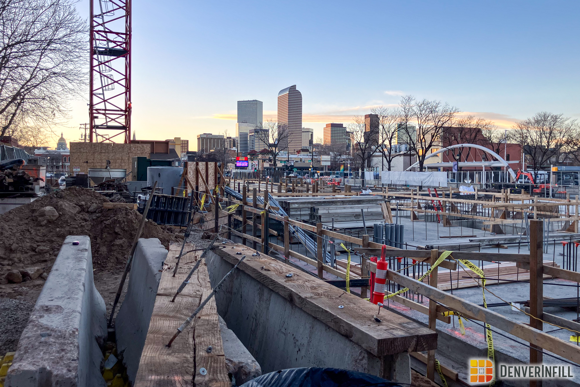
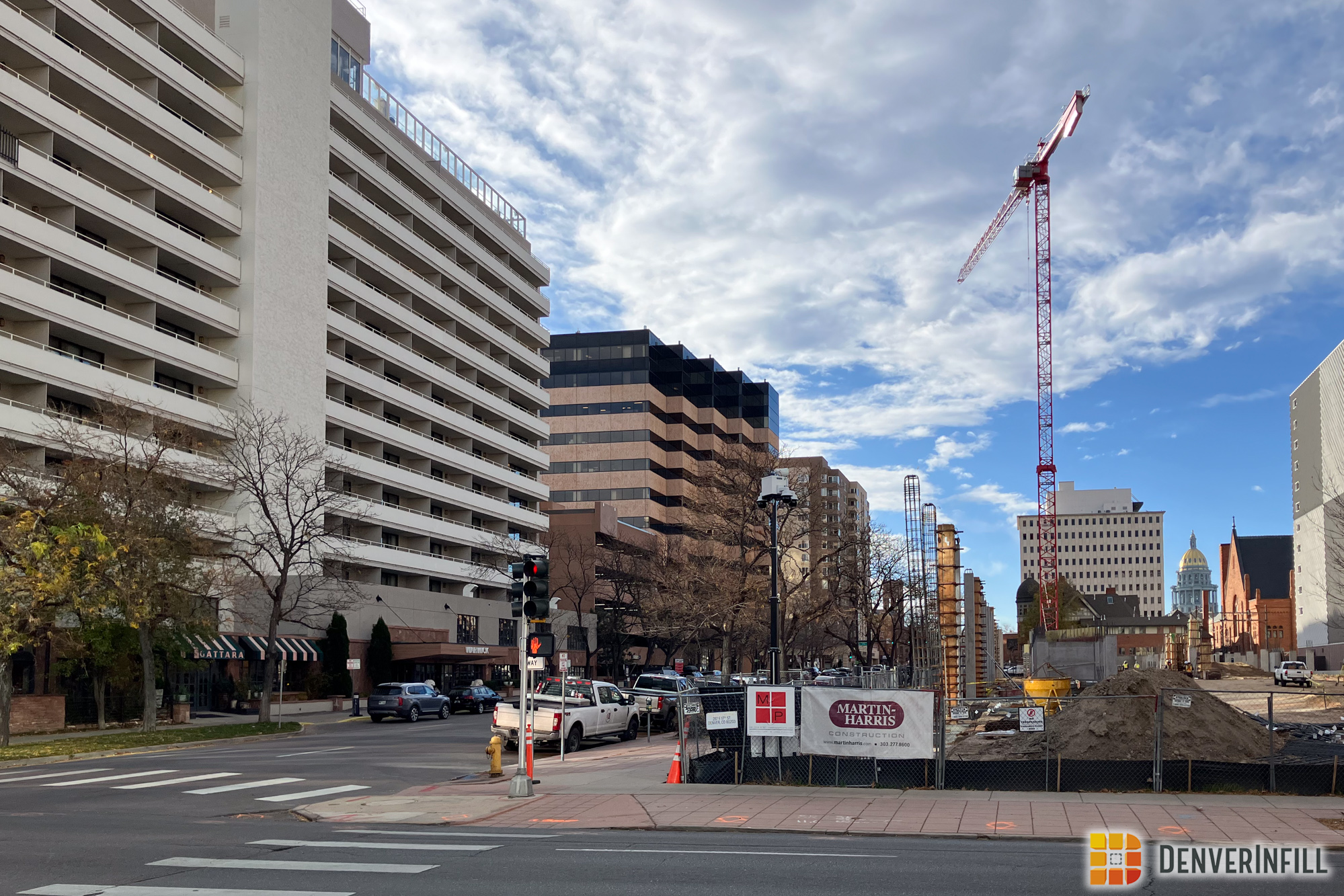
Construction of the 17-story Embassy Suites project at 14th and Stout in Downtown Denver is progressing slowly but steadily. In case you haven’t been past there recently, here are two photos I took a few weekends ago:
The developer has never bothered to share with the public a rendering of the full tower’s final design. I’ve sent them several requests but they have never responded. They also haven’t even bothered to post a project sign with a rendering on it at the site. Lame. Anyway, in that cool 14th Street video I posted about a month ago, if you look at it closely around the 1:25 minute mark you’ll see a 3D image of the completed Embassy Suites. A quick screen capture later, and here you go (click to double the size):
Let’s assume this is the final design.
The Embassy Suites website states only that the hotel will open in 2010. I’m guessing the 120-room hotel will open for business in September. What do you think?


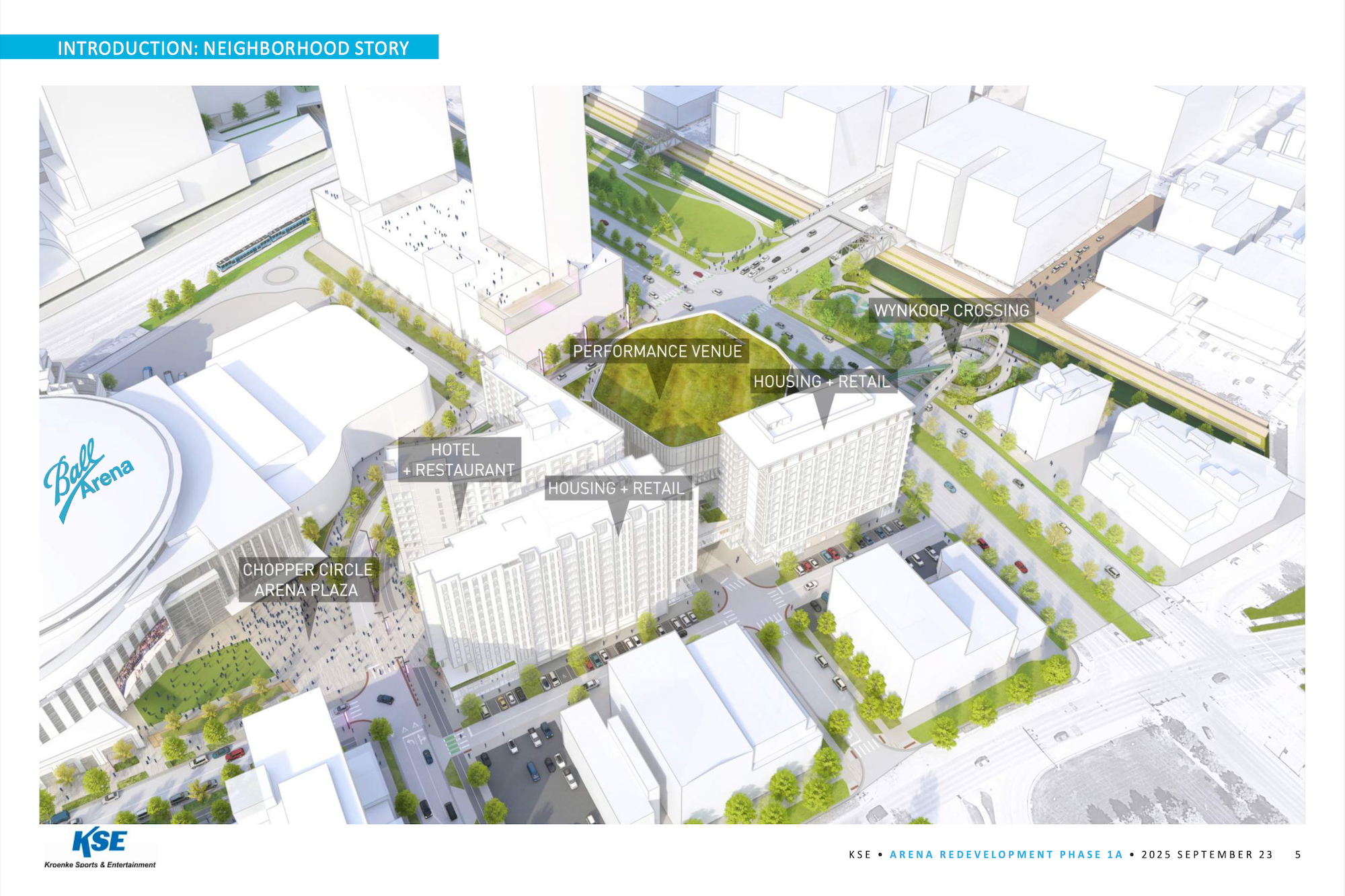


Strange… the rendering in the picture from the YouTube video shows the building as asymmetrical with a really ugly bar of concrete running vertically on the left side.
An elevator shaft? That'd be my guess. No wonder they don't want to show a rendering, because that feature would be pretty heavily criticized. What they do release shows the building from the opposite side.
Other comments from the previous version of this blog:
Anonymous said…
Another Denver box; but at least they are using a variation of materials for the exterior. We live in the Rocky Mountain West, which is full of inspiration yet all we get are more boxes. Another missed opportunity but it could be worse.
12/03/2009 04:03:00 PM
Speedbird said…
Pizzuti is probably right. All Embassy Suites have an atrium, so that would likely cause them to move the elevator shaft to a corner of the building. I agree it looks odd. at the very least, they could have made it a glass elevator to give it an interesting touch.
Otherwise, I think it’s a nice looking building (from what we’ve seen), and I’m glad to see 14th, er, Ambassador Street getting filled with more buildings.
Are there still plans to build that Best Western on 14th?
12/03/2009 04:16:00 PM
Anonymous said…
Wow. This is the first time I’ve ever agreed with Pittuti. That elevator shaft looking thing is indeed an ugly bar of concrete. Way to notice!
12/03/2009 06:13:00 PM
Anonymous said…
If you look at the construction photo taken from the front of the building, it looks like the elevator shaft is on the right side and the left side looks like a stairwell. The design couldn’t be much more ho hum, but who cares? It’s a bunch of new hotel rooms and the end of an ugly surface lot. Woo hoo!
12/03/2009 06:31:00 PM
Anonymous said…
last night I noticed the “Toothpick” at the four seasons is lit up. Very lack lustre. I am REALLY Glad it got built and it has elements I like, but in the end it is truly just another Denver Box, with a “Toothpick” sticking out of the top. The view from the East really is square like. The much talked about setbacks are not there. The rendering and scale model in the Four Seasons sales office does not match the actual building. Go see for yourself. I don’t mean to be sour grapes even though I sound like it, I just was soooo excited to see something more then a box… Brooks Towers would be as interesting if it had a “toothpick” stickign out of it. I recent trip to Atlanta and Miami made me realize just how poor the imagination is in developers here in Denver. I LOVE Denver and would not want to live anywhere else. Its a vibrant, beautiful city, I just wish we had some buildings to match. Four Seasons was close.. but in the end a disappointment to me
12/04/2009 10:48:00 AM
BeyondDC said…
The thing I don’t like about this building is that it’s basically strip mall architecture writ large. Compare this picture of a typical Target with the base of the Embassy Suites. Same combination of two-dimensional-looking brick and EIFS. Same simplified geometry and horizontal brick course work. Similar problems with proportion. Even the colors are about the same. These architects have taken a strip mall Target and just made it taller.
The cantilever at the top and the glass panel at center are the only elements that would seem out of place in a strip mall, and they feel like tacked-on afterthoughts.
More than anything, it just comes across as cheap to me. Not necessarily ugly (that Target is nice enough for what it is), just cheap.
12/04/2009 01:22:00 PM
Anonymous said…
The hotel will actually have 403 rooms, according to the approved site plan.
12/04/2009 04:46:00 PM
Anonymous said…
All things being equal…at 17 stories and considering what it replaced…I’ll take it!
12/04/2009 08:20:00 PM
hIstorymystery said…
I don’t agree with all this talk about a “Denver box.” All cities have architecture like this–Denver is not unique in this regard. Yes, places like Chicago and New York and a few other places have skyscrapers with more interesting silhouettes, but for medium-height buildings like this one, you’d be hard-pressed to find anything other than a flat-roofed box in any city, and the cheap synthetic stucco being used (I assume) for the light beige parts of the building is also ubiquitous–it’s simply a sign that our empire is in decline.
As for the strip along the left-hand side that probably houses stairs: eh, so what? This snapshot from the video doesn’t even show it all that well. It may well be ugly, or it could just be “there,” and we won’t notice it much when the building is done. It’s a logical location for a stairwell, in that a stairwell doesn’t need windows, and if another developer puts up another 17-story building next to it, it’s better to have something on the property line that has no windows.
12/05/2009 05:53:00 PM
Crush_Buds said…
Agree with everything you just said hIstorymystery!
We don’t need a amazing 17 story building with a fancy non-box-roof placed right next the convention icon that is the convention center. Especially sandwiched in between the Hyatt and Spire. I think it would be too much.
12/06/2009 04:52:00 AM
Anonymous said…
Atlanta, Miami, Fort Lauderdale, Jacksonville, Charlotte, Kansas City (MO), are seattle, portland (or) are just a few cities I have been to recently and I am sorry, but there are some really interesting buildings with huge setbacks, or something more then just a box, and some that are boxes are at least lit up to make them set apart. See the Bank of America tower in Ft Lauderdale, bank of America building in Charlotte, those are just two examples. also see CITYSKYLINEPICTURES.COM
you will see that Denver is a lot more “boxy” compared to others I cannot say this enought I LOVE DENVER, would not want to live anywhere else, so please don’t tell me to move to New York, Chicago or somewhere else.. Thats not the purpose of my quote. I am just saying I wish there was a bit more imagination on the part of developers and architects. I was on 104th and I25 the other day driving towards the city.. and 99% of the buildings look like boxes I am thankful that Ken has this blog for us to discuss our opinions… Thanks Ken
12/06/2009 08:54:00 AM
5280 said…
I will never complain about the architecture of any building that’s taking the place of a parking lot downtown. There are a lot of things I’d do differently with a lot of the new buildings, but I’m excited and very thankful that this building is getting built. I think people forget that twenty years ago downtown was a ghosttown of parking lots with tumbleweed blowing across them.
That said, in the rendering of the building that shows only the first few floors, what is up with that little sidewalk cafe? What kind of maniac would sit three feet away from the light rail to sip a coffee? I hope they locate that thing somewhere else.
12/07/2009 09:39:00 AM
BruceQ said…
Good point, 5280, but in the name of accuracy I have to point out that there was a building on that site. A rather neat and historic (albeit empty and dilapidated) building in my opinion, the old “Motor Hotel.”
Good point also about the proximity to the train tracks. 🙂 It’s not quite as insane as it seems, though, since that track is only an “emergency bailout” track.
What still looks scary to me is walking on what looks like a pretty narrow sidewalk, trapped between the building and the active northbound line.
12/07/2009 02:32:00 PM
Anonymous said…
I would liked to have seen something a little more modern to compliment the architecture and entrance to the convention center.
Regardless, it looks like it will be a nice addtion to 14th Street.
12/08/2009 10:14:00 AM
Saint said…
Eh, it’s another filler. But yeah, someone said it earlier, you can’t have too many iconic buildings crammed together. That is, if the Convention Center were supposed to be iconic. Did keep the LED ad sign? They really should have had that facing the Champa intersection, more cars would have seen it that way.
12/15/2009 10:39:00 AM
Ken,
What you are refering to as the ugly bar of concrete on the left is a stairway/sheerwall. The large rectangle centered on the south wall are the service elevators.
This part of downtown has changes phenomenally in the past few years. This hotel is surrounded by 2 buildings(The Spire and Hyatt Convention Hotel) that have come up in the past few years. I still do not know if the market has enough demand to absorb another 400 plus rooms. But good luck to them and all businesses downtown.