
Much has been made in various forums about the impact and character of the design of the new 1800 Larimer on the Downtown Denver skyline. With its unique facade treatment, it’s quickly landed in the love-it-or-hate-it conversations of downtown enthusiasts. Today, however, I drove by the building for the first time since construction barricades were removed to reveal the street presence of the building.
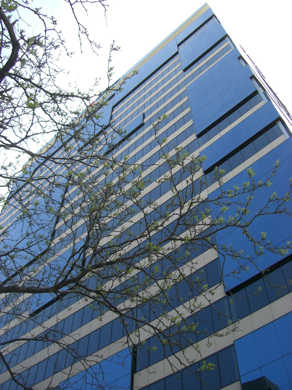
You should know that I am not typically compelled to stop my car (I know – should have been using B-Cycle!) to take pictures of anything. But I was so impressed with the relationship of 1800 Larimer to the street environment that I did just that. Say what you will about the impact on the skyline, but the biggest social and psychological impact of almost any building on the general population is the way in which it engages the “floor” of the city. I found 1800 Larimer to exhibit an elegant transparency and welcoming vibe at the building’s main entry – quite a feat considering the less-than-hospitable nature of the majority of buildings facing Larimer Street between 20th and 17th. The new experience along this block was a pleasant and unexpected surprise. Taken without the benefit of the sun, the pictures probably don’t do it justice – so I recommend that you get down to Larimer Street and experience it for yourself.


Very elegant and a refreshing break from parking garages and walls. I wonder what kind of tress they planted directly under that beautiful canopy. I hope they aren’t really tall trees.
Maybe some day Larimer can lose two lanes and give us proper sidewalks between 20th and 15th again.
(They’re not so great between 17th and 15th either. In spots, there are so many obstacles that two people must walk in file.)
Bill… as a matter of fact, the city is currently working on plans to reduce the width of Larimer at 16th. Not to the extent that you’re suggesting, but it’s a start!
It may look great from the perspective of the pedestrian but the design is a disgrace–it is an embarrassment for Denver. I don’t know anyone who thinks it is a fresh/goodlooking addition to our city. Shucks!
Whenever anyone says “design is a disgrace” then I’m pretty sure the building is going to be interesting and fun.
The new 1800 Larimer is a vast improvement on the one-story concrete aggregate filler building it replaces.
For anyone interested, the reason the sidewalks in this part of downtown are so narrow has to do with the Skyline Urban Renewal Plan of 1967. The voter-approved plan, which leveled most or all of 27 blocks, called for second-story plazas surrounding new high-rises, and bridges to link all of them. The thinking was that people living and working in these buildings would use the bridges to get around, so more space could be devoted to cars. So they added extra lanes, and shrunk the sidewalks, and of course the few bridges that were built became “problem areas” and were removed in the 1990s. I think the city should reverse the Skyline Plan, and restore sidewalks throughout the entire Skyline district that are the same width as those above Curtis Street.
Using the logic above: You could build a nice TGI Friday’s in the place of a run down Taco Bell. Guess what–it would be an improvement. But is that really the point? We can do better.
Great shots. I really like the 1st one.
“Say what you will about the impact on the skyline”. OK, I will: This building is far and away the ugliest building built in Denver since at least 1971. It is a ridiculous mess that illustrates the total lack of creativity of it’s designers who simply copied three outdated looks and then mashed them together. Amazing and sad that this building got built.
Love it or hate it….?
Who loves it?
The other day I was driving and pulled up to the same intersection. I turned and looked and said to myself what building is that, it can’t be that new eyesore, but it was. I did not park and get out like you did but before the light changed I was pleasantly surprised with what I saw! I love all the glass curtain walls and how the entrance relates to the street; if only the rest of the building looked/felt the way the entrance does. Oh well, still better than a parking lot!!!
I have a nickname for this building: The Scab Building.
When I saw I going up, I was briefly convinced that the scab-patches were temporary.
The ‘beauty’ of scabs is that they cover a wound while it heals.
Unfortunately in this case the scabs are permanent.
The building is generally fine, and I like the glass panels. The true problems are the color choices for the materials. They don’t mesh well at all.
I was walking around the Ballpark neighborhood a few night ago and I actually say it looks better at night when the roof is illuminated that the contrast between the panels isn’t as noticeable. It actually kind of had an interesting futuristic vibe to it. Agree that it’s not the best during the day though, but I take whatever positive I can.
I agree with Eleanor. I think if they simply changed the brownish lines into something black or closer to the window color it would look much less like the confusing mash of stuff that it is. I head heard from someone that the color choice was originally something black or blue for these, but the color was changed by the developer.
I like it! I think it’s unique and interesting. I like how it simultaneously stands apart and blends in with the rest of the skyline, unlike One Lincoln, which just stands apart. I like how the blue panels tend to capture and frame little pieces of the sky and the surrounding buildings. And I especially like how it almost satirizes the “boxy” label Denver’s skyline seems to have earned.
And I love the street level “user interface”! It’s open and inviting, and it brings all the “macro” design elements down to a personal level.
It’s amazing how this buildings appearance seems to change depending on the amount of sunlight. I think it looks best when the blue panels and black horizontal windows almost look like they are the same deep blue color in some instances of low to medium sunlight. I agree that there could have been more creativity involved in the design and I think that it will become dated within the next 5 years, much like the SugarCube. Nevertheless, the ground floor looks really good.
Oh and the trees are INSIDE the building. Not under the canopy!
http://www.rnldesign.com/files/pics/Commercial_Mixed-Use/Projects/1800%20Larimer/Optimized/1800_Larimer_CRYSTAL_FINAL_.jpg
This building has great street level cohesion. Unfortunatly, the rest is a mess. It looks like a jumble of dated styles…chaos baby! Not a welcoming view from Union Station.
I agree with Julio – I saw this building (or realized what it was) just this weekend when my parents were visiting from out of town. It was later in the evening and it looked pretty good. It certainly isn’t as awesome as Spire, but I also think it is far from being an eyesore.
This building adds to our skyline and it does look awkward but regardless it’s something that replaced an empty lot. There’s no other box out there like it and at night it really looks amazing. This is a good addition and gets rid of a parking lot.
I am amazed at how many people comment on how much they hate the look of the building without mentioning its Platinum LEED status. Let’s get real, a developer can spend money on a facade or they can spend money on making a building environmentally friendly, it’s hard to do both. Westfield opted for the later and I praise them for that.
Personally, I like it. The building is distinctive and modern (the whole pseudo-Bauhaus disjunctive boxes thing will look dated soon, but I don’t think in away that makes it (or the city) look absurd) and its position/height at the north end of the CBD gives balance to the skyline when you are approaching from the airport and SB I-25.
Not my favorite building, but I would contend that it looks better and more unified all around than, say, the stunted robot that is the Four Seasons.