

Staying in the Lower Highland neighborhood, we are going to take a final look at Lumina; a quirky yet refreshing design for what could have been a typical apartment project. Our coverage for Lumina was fairly limited but here are our previous posts:
New Lower Highland Project: Lumina
Lower Highland: Lumina Update #1
There is a lot going on with the design of Lumina between the jagged, or rounded, sides of the building, the metal screen, different sized terraces, and the large solar array. One very interesting thing to note is the integration of the old Pagliacci’s neon sign on the facade; a tribute for what was once on this site.

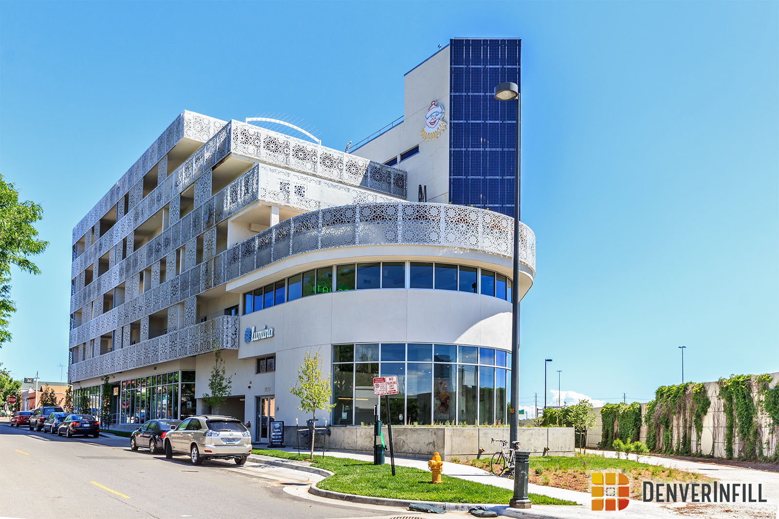
Here is a detailed look at the metal screen that wraps around the entire building.


Rising 5-stories, with ground floor retail, Lumina provides the Lower Highlands neighborhood with 61 botique style units. For pricing and floorplans, head on over to their website.


This has got to be one of the ugliest buildings in Denver, it looks like an arabic prison.
I usually don’t like to say anything negative about these projects, but you’re right. Every time I drive by I hope that it will grow on me, but this place is hideous. I’m sure the inside units are nice though.
Looks like it belongs in Beirut, Lebanon.
I like it, its a nice break from the cookie cutter apartment buildings that dominate LoHi.
I kind of like it, has a Spanish/Arabic feel. Once the trees and Ivy grow in (per the original rendering) I think it will look a lot better.
The greenery will never look like the rendering!
I think the building is cool. It looks like it could be in the south of Spain. The rest of the Pagliacci neon signs are restored and placed inside the building. I applaud the developer for not creating another cookie cutter apartment building.
It looks like a south florida casino.
That clown just makes it worse.
I don’t think this will age well. Some of the balconies are already rusting.
An unusual building! Keep it up!
love it! this building looks great…finally something DIFFERENT. happy to see more retail along navajo too. welcome!
“Build something unique and original!”
…
“Ew, not that!”
I like the building.
My thoughts exactly.
People hated the Michael Graves addition to the Denver Public Library when it opened 20 years ago. I liked that building then, and I like it even more now. Love it or hate it, Lumina is the most interesting new multi-family building to go up in this city in several years, and I believe that 20 years from now it will be still seen as interesting–unlike just about everything else of the 5-story stick-construction apartment genre going up in this city these days. I’ll take it anytime over the likes of the suburban-style project across the highway from Lumina, where Rockmont Envelope used to be. Bravo to the developer and the architect (Tres Birds Workshop) for taking this risk. The architect’s website (link on Ryan’s announcement post from 2013) offers a lot more images, including balcony shots and a view of the Guggenheim-esque atrium. My only beef is with the first floor retail space–such generic detailing on an otherwise unique building.
I love how unique this building is compared to anything new we have seen recently!
What were the developers thinking? This thing is ugly and doesn’t even look new. Maybe a different color on the exterior would help. The smog from the highway will probably wear on it.
That building is an eyesore! Weren’t the panels supposed to be the defining element and stand out from the rest of the building as a silver color? Who builds a white building next to the interstate anyway? Very poor design all around.
Terrible building. It would fit Miami for sure, but Denver has its own style, why ruin it. When that white ornament becomes rusty and dirty, that’s when everyone will truly appreciate this ugliness.
Definitely pretty ugly, but at least it looks different.
I love it. The clown is cheesy, but I love everything else about it. It does remind me of apartment buildings in the Middle East, but an upscale, modernized version. I used to live in one such apartment in Kuwait an eternity ago. Kuwait was (and I believe still is) pristine. Our apartment was across the street from the Persian Gulf, so we had sea views all around. It was a simple, humble, lower middle class building, but it was airy, clean and a great place for a toddler to grow up. Just because this building looks Middle Easter in design doesn’t mean that it only evokes war torn, bombed out Beirut.
I drive by it every day and am so glad it doesn’t look like all the rest of the apartments in the Highlands, or Denver generally.
I saw the pictures of this building and couldn’t believe how horrible it looks.
So I had to drive by and take a look for myself. It is hard to believe but it actually looks worse in person.
If there were Razzie Awards for Denver buildings we would have a sure fire winner.