
Back in December, we shared exciting new renderings and provided details on the 18th and Market apartments that will be eradicating a soul-sucking surface lot in Lower Downtown; we all know the stretch on Market Street between 18th and 19th needs some serious development. This project should be wrapping up its rounds with the Lower Downtown Design Review Board as they iron out streetscape and lighting details on February 14.
Since our last update, not much has changed in regards to the design since the LDDRB already approved it. As a refresher, let’s revisit the renderings. Below is the project from 19th and Market.
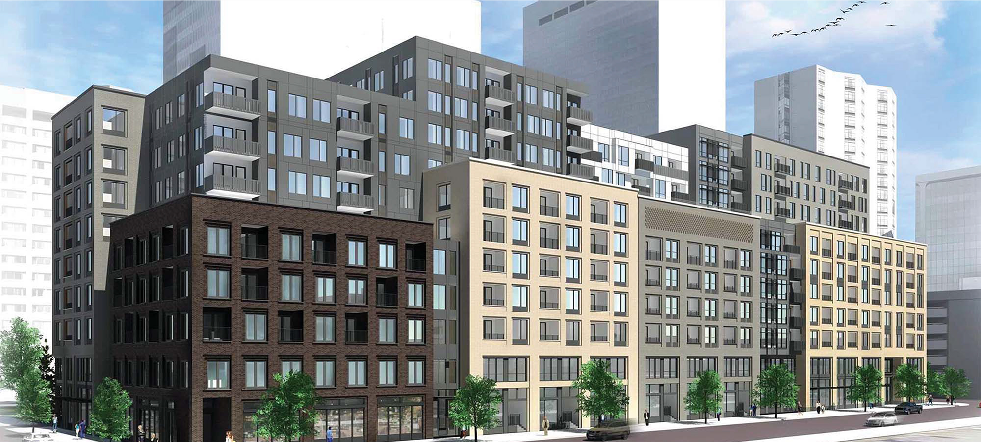
… And from 18th and Market.
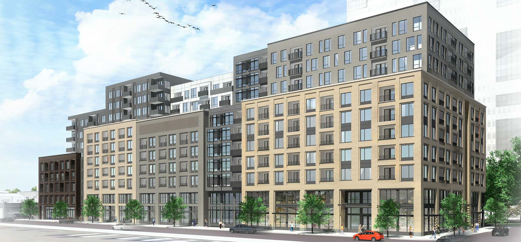
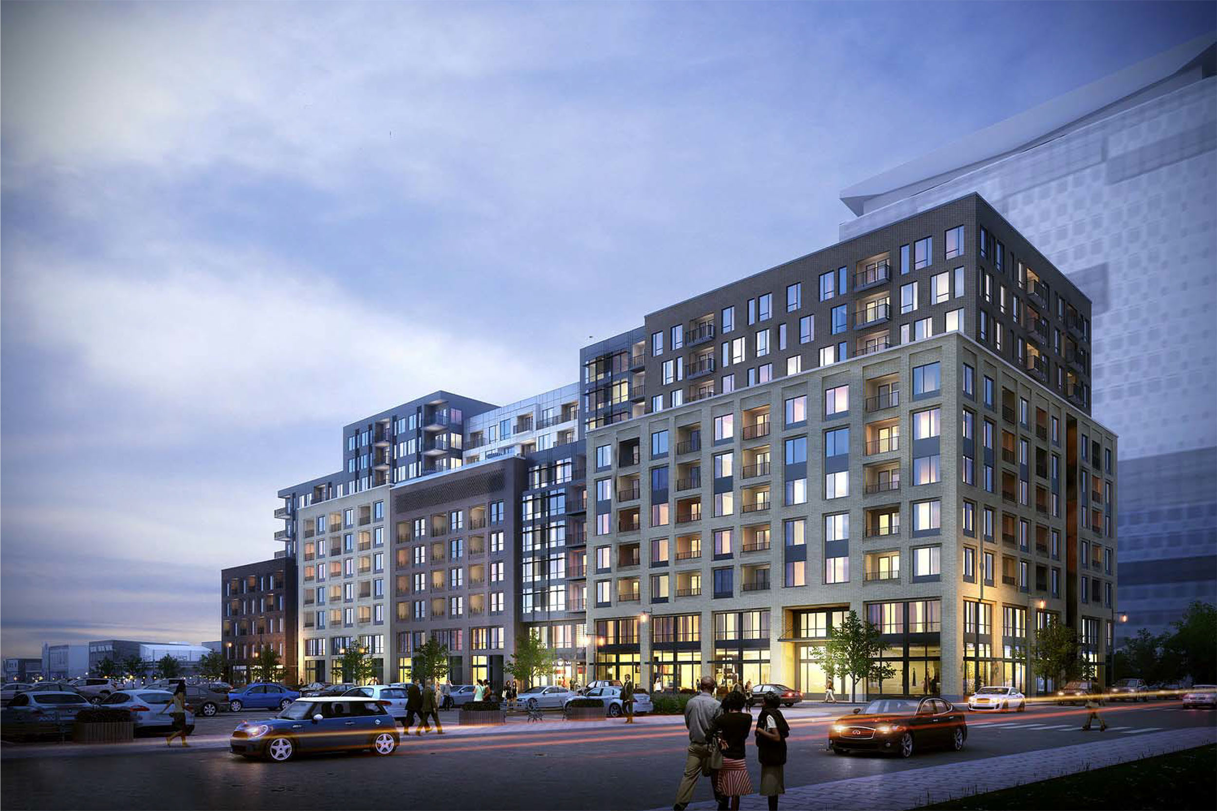
In addition to the daytime renderings, Johnson Nathan Strohe, the project’s architect, also added two dusk renderings to the submittal documents. Here are both of those renderings from the same perspectives as above.

Hopefully after this round of design review, we will finally have a construction timeline for the 18th and Market Apartments. Stay tuned!


This development should be the model that all land barge-type developments that may happen in Denver have to follow. Not only is the facade broken up, it creates a real sense of different buildings by using different colored bricks and patterns as well as architectural treatments. Unless they saw the upper portions, pedestrians walking along Market St might very well be convinced that this development is made up of different buildings. Furthermore, the developers achieved what I think is a good balance for activating the street: residences in the center along with the lobby/community areas and corner retail/commercial spaces. Every new large development in Denver should have corner retail/commercial spaces as that reflects historic patterns in older, denser cities. If the retail spaces doesn’t take off right away, then the developers are not wasting the entire ground floor. Once it does, however, then the city and the neighborhood gain a nice lively corner.
Miles ahead of 999 17th st in terms of design and street interaction.
When I first looked at the renderings, my initial reaction was “BORING, just another half-ass land barge that we’ll take because anything is better than nothing.” However, I asked myself what would I have wanted there instead. After reflecting for a minute, I think this is not bad. Given this location, I like the generous use of brick and appreciate that it is not just on the first 1-2 stories. Although I think the EIFS make the top half look cheap. I also like that the different color breaks up the massing with varying step-backs and elevations. Having retail space is a no-brainer and I hope the developers along Welton St. will become enlightened too. I’ve argued before that this is pretty basic Architecture 101 but I’m glad to see a development where they did and did it well.
I agree with you about the fiber cement panels but the good thing is that they will only be on the upper portions that are set back 25 ft from the portion facing Market Street. The upper portions facing 18th and 19th will be brick.
Ugly, ugly, ugly…, uninspired, square, brown and gray…you put lipstick on a …its still a …
I mean, I admit it is uninspired, but it is better than anything going up in Arapahoe square. Really the only difference between this and all the other new buildings in LoDo, is it is a block long and has the same zoning for the whole block.
I do love the breakup of the facade at street level, but it’s still boring as hell. Same crap that they’re going to do at Market Street station. We just keep reusing the same design over and over.
Couldn’t care less Ryan – this lot has been a trash strewn pig since before most people on this board were born.
It is great to see these ugly parking lots being replaced by new developments and here is an idea that I bet few have thought about.
I would like to see the city of Denver form a design review board for each of the inner city neighborhoods that are going through
this redeveloping or gentrification process. That way we could possibly see less of the hideous condo buildings that are popping
up in the Highlands, Jefferson Park, Sunnyside and other inner city areas. This design review board could approve designs that
actually fit in with the historic architecture of these communities instead of sticking out like a large sore thumb, like they currently do.
Any thoughts on this idea?
LoDo does have a design review board (LDDRB).
I’d argue that their stringent requirements and review process is largely to blame for the monotony of architecture in LoDo.
Sugar Cube was a successful project and that architype has been pushed ever since. (16M being the most egregious example)
There is the (incorrect) notion that because the historic buildings in the area are brick, that all new construction needs to be brick as well.
One of the things that makes cities great is the juxtaposition of eras – a building from 1880 next to one from 1940 next to one from 2015. Each building, being of its own time, adds to the character and history of the area. Forcing modern buildings to adhere to an artificial aesthetic standard results in a false historicism – Disneyland main street.
I look to the SugarSquare building as a great example of how a modern building can fit into a historic context without being referential.
As far as other neighborhoods in Denver, many do have design review processes. Keep in mind that ‘fitting in’ with historic architecture doesn’t necessarily contribute in a positive way to a neighborhood. Usually it results in banal buildings, which do more to detract from the character than add to it. Buildings that relate to their historic context in a contemporary way add to the character and richness of a neighborhood, not “stick out like a sore thumb”. (btw, very few of those projects are condos because of construction defects law, but that’s a different conversation).
It’s a matter of perspective. I think people from Denver need to take a look at other cities and realize that this emphasis on emulating historic buildings is resulting in a banal urban fabric. The other thing really hurting architecture in Denver is the adjunct fear of height, which leads to the 5-10 story land barges we see above (even if they are nicely resolved and relatively attractive).
I think there is some merit in establishing neighborhood-specify design guidelines that are strictly enforced. While a design review board may turn out to be needed, it would be better to just start with guidelines. As long as the intent is to reflect neighborhood characteristics and not limit development potential. Those city center neighborhoods need to grow.
I do like the changes in facade and heights along with concealed parking (!!) but the LoDo guidelines seem to stifle any chance at creativity.
Most block in LoDo have the same zoning and are reviewed by the design review board. A lot of the comments in response to the design of this development makes me wonder if anyone has looked at the design guidelines. The review board does not want infill buildings to mimic existing historic buildings because the may start to make LoDo look like an historic-styled Disneyland. Blocky structures with brick facades are favored. By intent. Glassy, abstract, rounded or severely angled designs are not favored and, besides, a block-long development of that would really look bad. Buildings with those types of design elements are better in small doses, meaning only a relatively small portion of the street frontage, relative to the height of the building, should exhibit an “unique” look. The alter the building, the large the street frontage. One of the reasons 2300 Welton looks so bad (IMO), is that it takes up an entire block. If only the corner had that sort of abstract design and the rest was more in keeping with the surrounding architecture, than the whole development would be more aesthetically pleasing. Again, IMO.
These new renderings look great!
Is there any information as to who the general contractor will be?
Asking like Mike did: Is there any info as to who the GC will be? Thanks!!