

Developer Buzz Geller yesterday revealed the preliminary design of his proposed “Bell Tower” located at Market and Speer on Block 242/044 in Lower Downtown Denver. Geller always said he wanted the tower to be architecturally significant. Thanks to Fentress Architects, the proposed design is definitely intriguing, that’s for sure. Here’s a lower-resolution image:
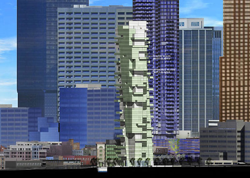
John Rebchook at the Rocky Mountain News this morning reports more on the proposed 33-story tower, and also has additional renderings of the project. Click here for the article. I hope to be able to post high-res versions of the renderings soon. All images are courtesy of Fentress Architects.
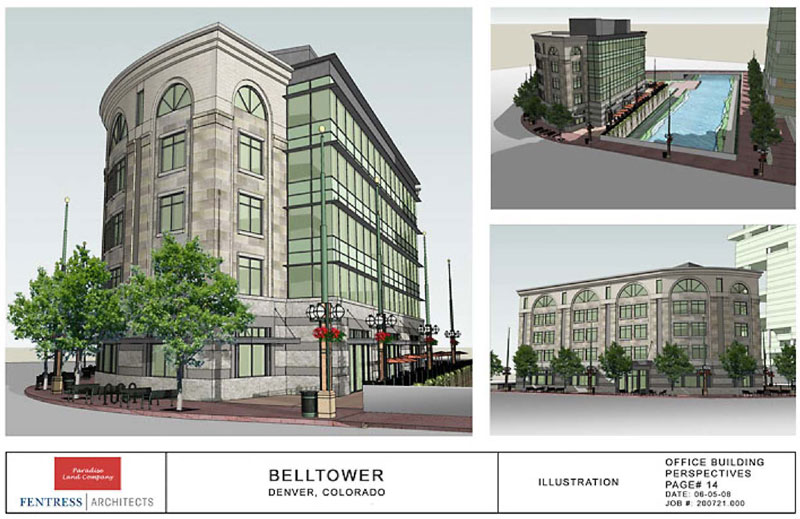
The project also includes a much shorter office building across Cherry Creek from the tower, at the corner of 14th and Market. The office building has a more traditional design:
The project must still be given final approval through the Lower Downtown Design Review Board, which reviewed the project yesterday. You may recall that Geller obtained the right to build a tower up to 375 feet tall at the Speer/Market site due to the creation of a Special Review District under the LoDo design guidelines.
With prices for the Bell Tower’s condo units at or higher than those of the Four Seasons, who knows if there is the demand out there. But with only 33 units total, Geller has far fewer units than the recently-cancelled 1401 Lawrence project. Either way, Bell Tower would certainly have a dramatic impact on Denver’s skyline!


looks like a bad game of jenga but i'll take it! and hopefully renshan is looking to build their own 51 story tower.
Please tell me this "tower" is a joke…it is an eyesore and should never be built. The office building looks fine though.
I'm confused–Wasn't the 14th and Market lot to remain open space if his tower was approved?
LOVE IT!
Very stylish! Good to see exciting design coming to Denver
Love the office building. The tower looks like a computer glitch. The architect needs to fix his CAD program before he prints out his rendering next time.
Oh, and they need to can 1401 Lawrence out of the background.
I personally don't like it but we need it in our town. It would complete the Denver Art museum thing on the other side.
very iconic and breaks the mold of boring building in Denver
Yes! Yes!
Outstanding and unique.
Go Buzz go!
The office building looks very classy for that location. However, I wish that Geller would go for a more classic look with his tower – not a box, but something with ornamental touches and a crown. This architectural movement of weird geometrical shapes of different sizes clumped together just doesn't appeal to me. I'm glad the board asked for a refinement, because they could do far better.
We should all protest outside on behalf of buzz
Finally, a residential/office building that is truly different.
The smaller office building looks amazing! It is the perfect design/scale for right next to the park and the Cherry Creek. I could definitely see an upscale restaurant, with outdoor, creek side seating becoming one of the most popular in Denver.
ABB – Anything But a Box… I'm not wild about the "shard" genre of architecture either (as seen in the DAM,) but I do think it would be good for Denver to get something, anything, different. So, I'm throwing my vote in with the "Go Buzz!" crowd.
I'm in! Go Buzz!
I have seen the model at Frentress' office and pictures don't do it justice. The development delivers just what was promised–an iconic building, a small office building (very nice)and a huge amount of open space.
Oh dear god any design but that. The architecture is messy looking and the tower looks like it's about to fall over jenga style. In fact I'd almost rather just see the office building building go up and not the tower.
Did anyone see the previous design before Buzz turned the project over to Fentress? It was simple, sophisticated and elegent like the Perry Street towers in NYC.
This design is a monstrosity and will fight One Lincoln Park for the title of ugliest new residential high-rise downtown.
Terrible…
Go Buzz! It's different and eye-catching and I like it.
OMG, The office building is stagnant makes me want to hit the snooze button. The tower might not be to everybody’s taste, but at least it offers something to one of the most boring skylines in the world. I mean, can we add one more box to this city?
p.s. I've seen the model and the other renderings and 11:25 is right, these here don't do it justice.
all right some of you are boring 90degree square sharp angled people. Don't you like buildings that have some character instead of the boxy buildings. C'mon now. Variety will bring life and something for tourist to look at while they enjoy the city.
just what i was thinking Jeff 2:26…
The comments so far illustrate REALLY well that you will always have people with differing opinions and you can never truly please everyone (doesn't matter if it's food, architecture or t-shirts ; )
I say YAY! for creativity and uniqueness in any project and whether I really like the look of the tower or not, it certainly seems ambitious and creative.
The world changes and there is always room for ambitious architecture like this. Stop with the hate already..or don't. I don't really care because Denver blows!
(bring it on)
The tower looks interesting and possibly great (depending on materials and detailing), but the office building looks like it was meant for Omaha. There's really nothing worse than this kind of fake-historical pastiche directly across the street from the real historical structures in Larimer Square, and while it might have been acceptable for Denver in 1987 or so, it isn't now. Worst of all, it bears no relationship to the tower at all-the two buildings should work together as an ensemble. I hope the LoDo review board makes Fentress completely scrap the design for the office building and start over from scratch. The tower needs refining, but I like what they've done so far.
I'm into tall, cool, unique, but even I have to agree that this building is a bit of a mess. The construction of this tower would confine us to boxes for the next 50 years because it is all people would talk about, "Please Dear God, nothing like the Market Street Monstrosity!" I loved Fentress's comments in the paper which suggested that he's been controversial in the past–the DIA rooftop, for example, was not originally well-received. Well, I hate to say it, but this building will never be well-received. One small change could change all that. Say so if you agree…
Symmetry. Preserve the spiraling design and the jugging shards, but throw in a bit more symmetry especially at the top, and you'll have a winner. This spot is too prominent to put up something tall and but totally out there. Were it in the center of the core or on the east edge even so just the top peaked out, maybe. But this would be in full view.
Have a yin and yang thing going on here. That office building has got to go while the tower is an exciting departure from the mediocrity that neighbors it.
Get a fresh and hip pizzeria located there and this will be the leaning tower of Denver.
I like both. Its his land, he should be able to build his building. If you don't like it, I suggest buying the parcel from him.
I have to agree with you there megatron. Its a part of history and innovation or some idea that will always be there. People down the road may give kudos to the building and some may hate it but its a milestone for Denver (a place you don't care for evidently). Whether its a good milestone or a bad one, its part of our development and we should embrace it for what it is and how it integrates with the other buildings. I think the contrast of boring buildings like the republic plaza and buildings like this would help our appearance in the world of skyscrapers and cities. Lets just hope that we get more conventional buildings with a moderately interesting design that bridge that gap between the dry architecture to the really extravagant. Folks, support Buzz because having that there is better than nothing.
Anon 7:49 pm That was hilarious! And so true! But I also agree with anon 7:48 about the need for greater attention to symmetry for the prominent locale.
Paint it yellow and it will make a nice companion piece to the block sculpture on I-25 and Broadway.
I really disagree with those who argue that boxy buildings are inherently bad buildings. Republic Tower has stunning proportions if you take a few seconds to look at it. Its biggest problem is that it is fairly awful to walk past at street level, not because the top is boxy.
It's easy to dismiss anything boxy and embrace anything that isn't a box, but that mentality can lead to a terrible architectural legacy for Denver.
The thing that I dislike about this tower is that it seems like it is trying so hard to avoid being a box that it never actually becomes anything on its own — it's just a box with a bunch of shit strapped to it. It's completely arbitrary, doesn't have any sense of rhythm or balance. In some ways, this reminds me of Stephen Holl's Simmons Hall in Boston, which is a complete disaster in real life. Like Holl's building, this design runs a risk of looking like it is permanently under construction. I love the idea that Denver could have an iconic, decidedly contemporary skyscraper, but to me this seems like a bad way to go. Contemporary is not the same as gimmicky and arbitrary.
I'm curious to see how this design progresses, and I hope the previous comments are right in that these renderings don't do the building justice. I believe that design is 10% creativity and 90% editing — Fentress has a lot of editing to do.
Ah, the first comment captured exactly what I was thinking: Jenga tower. If this gets built I am pretty sure that's going to be what everyone in Denver calls it.
I'm against this tower's design. "Architecturally significant" doesn't mean it the shape shouldn't be recognizable as a building. I think there are ways to make a building "significant" but also look good.
I really do like the smaller tower's design, though.
I agree with ryan nee—I like the concept and I like that they're going for something iconic, but according to this rendering it definitely needs some tweaking. Not a lot mind you, but just enough to establish it as both different and good.
As for sunshine megatron, why come to this site if you don't like Denver? Doesn't make a lot of sense. Clearly you have some affinity for the city or you wouldn't waste time on this site.
It is really hard to understand what this building will look like without a higher resolution rendering, but I do think it still needs some revision. I love that they are trying to create something dramatic and unique, but it also needs to be pulled together. They have the right idea with the lower, commercial building. It should respond and complement Larimer Square and serve as a transition to the high rise as viewed from Larimer. With the right retail tenant, the corner of 14th and Larimer could be very successful with so much visibility. Having a restaurant with a patio overlooking the creek and the condo building is ideal. It is hard to believe that with all of the development adjacent to Cherry Creek, this will be the only restaurant with a creekside patio. I am thrilled to see this project moving forward as it will really contribute to Larimer Square, my favorite area of downtown, and probably the main attraction for visitors. I think 1401 Lawrence failed because it was just to big for the current real estate market and because the design was lame and completely uninspiring. If the hotel/condo market isn't oversaturated, I think something like 4 Seasons or Ritz Carlton should be built there. Denver still doesn't have a Mandarin Oriental or Le Meridian.
Corey
I'm waiting to see the high-res renderings before I pass judgment. I'm intrigued by the design, but also mystified that they haven't released high-res renderings anywhere. That's the easiest way to get turn sour initial public opinion for a project. Show us the details! I do think this is the perfect location for such a project too. I love the contrast now between SugarCubed and the rest of Lodo… I'd love to see more of that.
it would be cool to have at least one skyscraper from denver that makes the skyscraperpage.com front page. Look at some of those retarded buildings, jesus.
Everyone should go to the RM News web page to view the slide show. Ken's link doesn't take you there. Once there search for "Wraps are off proposal for unusual building". These renderings are cool. They show the skyline with the Spire, Four Seasons, Tabor II, and the Great Gulf Tower all completed. Too bad GG pulled the plug. There tower definitely added a lot to the skyline.
One Thing I like about this design is its proximity to Walnut Street. I can just imagine driving down Auraria with this building towering above…I hope it gets approved!
Are the representations of buildings in the background just a random mish-mash of other downtown structures? Why? What elevation of the building is shown?
As is the case with everything that comes out of Fentress, this design is all about ego and nothing about refined design. They are incapable of generating an elegant, original design concept. This thing is nothing more than a brutal collision of two Calatrava towers; the Turning Torso in Sweden and the 80 South Street in Manhattan. And it's a pathetic version at that!
http://www.mediaarchitecture.org/wp-content/uploads/2006/07/TurningTorso11.jpg
http://img.slate.com/media/1/123125/2079215/2133224/2141016/060503_SouthStSeaportEX.jpg
Take a look at the SlideShow that was part of the original Rocky article. Perspective #3 is truly amazing! What a great skyline Denver will have coming in on Speer or Auraria Parkway.
In the slideshow you'll also notive how the creek facing side of the smaller office building is very contemporary and matches the greenish glass, while the other sides better compliment the historic buildings of the area. Very nice.
I do agree with the Review Board that a staircase from the patio to the Cherry Creek Bikepath is a must!
http://www.rockymountainnews.com/news/2008/jun/19/wraps-are-off-proposal-for-unusual-building/
Anon 08:54
I agree, when I first noticed the graphic in Ken's post, I thought… Wow, it looks like they are creating a second version of the I-25 and Broadway sculpture closer to downtown.
BTW – Does anyone know that the I-25 and Boradway sculpture represents or what it is called?
I agree with Anon 9:01. Now those are examples of avant garde architecture that I'd embrace. I'm not against anything that looks new, just new looks that are ugly. Simply because it hasn't been done before doesn't mean it should be.
But looking at the slide show, it doesn't look too bad. Just wish I could see a rendering without 1401. It almost needs the contrast of 1401's squareness. Or maybe if they could make a rendering of a view looking up Speer.
qANONYMOUS…
Are the representations of buildings in the background just a random mish-mash of other downtown structures? Why? What elevation of the building is shown?
The images on this site just have a mish-mash of buildings. I think to show the elevation in comparison to other towers. If you look at the footprints on the RM News slide show the tower is placed right on the edge of Walnut and Speer
I saw two things right away: Jenga & Turning Torso. Maybe Denver can become the city that creates average copies of historic buildings…Think Bilbao vs. DAM, Turning Torso vs. Belltower. I look forward to seeing the naming rights sold to Hasbro – with the requisite 'Jenga' lit up in rotating red, green & blue neon…now that's kulture with a capital K!!
Anon 10:09:
You asked about the sculpture at I-25 and Broadway. It's called "Articulated Wall," and the artist is Herbert Bayer. There's more information at http://www.denverdesign.com/about/.
I bet the pigeons will love it
Probably not my cup of tea, but I appreciate the idea of creating an iconic, ditinctive building at the edge of downtown. That classic building has got to go – yikes"! Is that a reference to the Congress of Old Urbanism? Wouldn't a contemporary interpretation of the classic Larimer Square context be more appropriate?
Thanks for sharing vicki! I knew someone would know.
– M