
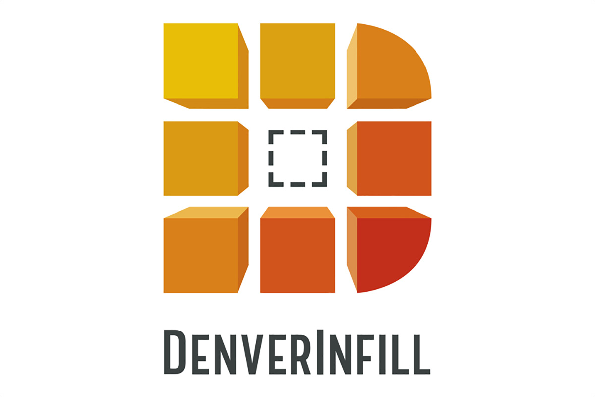
Notice something different about the DenverInfill Blog header? It’s our new logo! I’m extremely happy with it and my thanks go to the good folks at Dovetail Solutions for their creativity in helping me develop the new logo, and to Keynote Support for their web design expertise. Those of you who are friends of DenverInfill on Facebook have had a sneak preview of the logo for a week or so. Today is the official reveal.
This is the first of a few changes coming to DenverInfill in the near future, including something entirely new relating to urbanism in Denver… stay tuned.
![]()
Also, thank you for the great turnout at Saturday’s DenverInfill Tour of the Union Station project! The next tour is scheduled for Saturday, November 6.


Good job like the logo!
Love the logo. Great design!
It’s kind of boxy
Nice logo! Love reading the blog these days. FYI, the old logo and title is “ghosting” over some of the text at the top of the page in white…
You should put the logo on the little space next to the url so it’ll show up on people’s favorites list.
Nice work! Love where things are headed…
Thats a great logo, but I can’t wait for the next West Corridor update!
I like the logo! Perfect for the favorites tab on my browser. However, it seems like lately the logo should be a big RTD symbol. Isn’t there ANYthing else going on in Denver other than Union Station and the rail expansion to blog about? I love the site and the current blogging, don’t get me wrong. I just can’t help but wonder what else is going on in our great city.
Yes, Marc, indeed there is. That’s why there’s something new in the works…