Here’s a quick update on 16M, the new mixed-use project located at the corner of 16th and Market in Lower Downtown Denver.
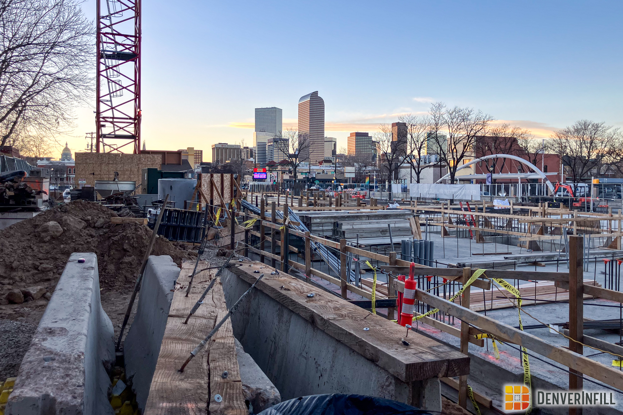
On New Year’s Day, Ryan posted Update #1 on the development: photos showing that the old Office Depot building had been reduced to a pile of rubble. I’m not sad to see the former building on this site go.
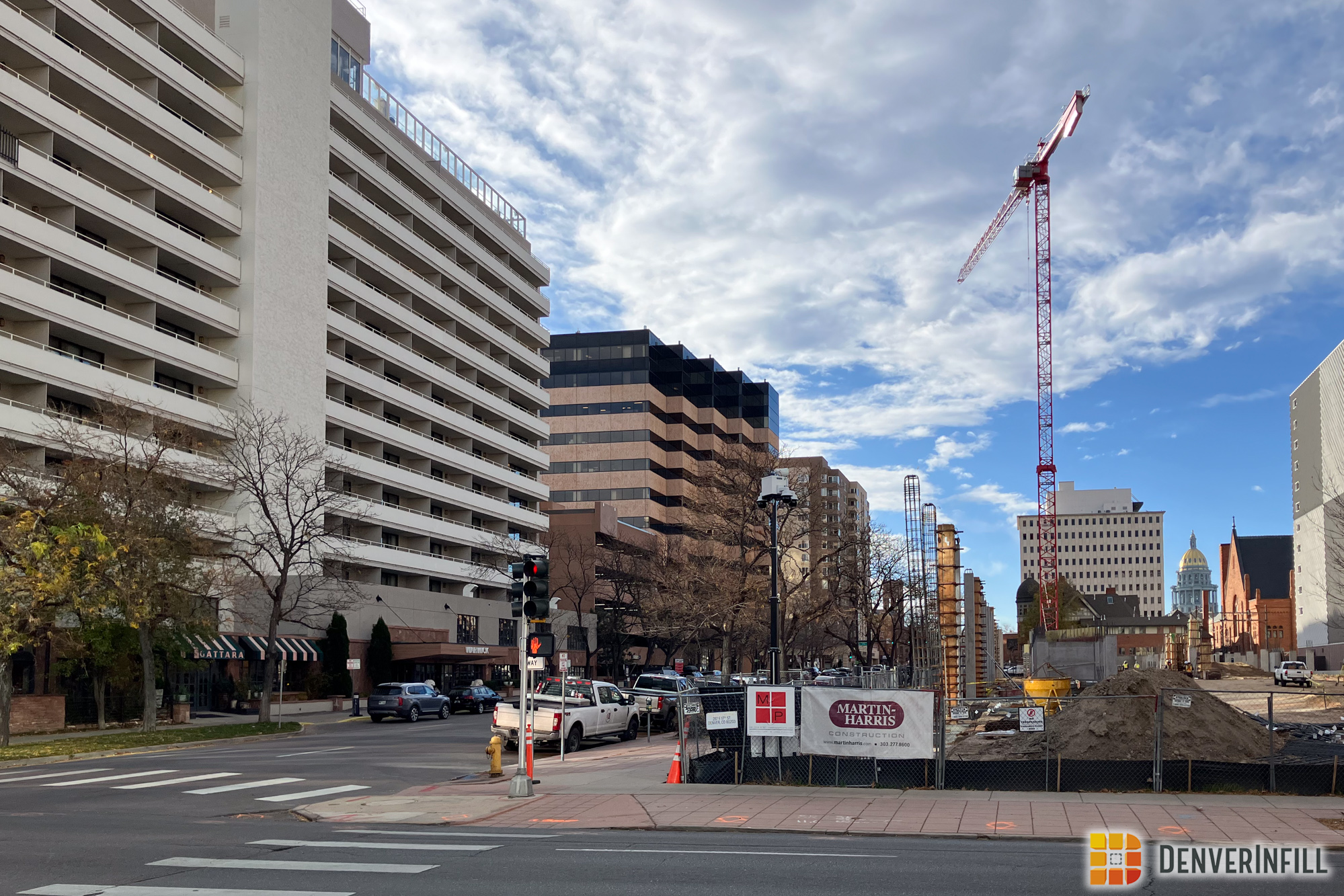
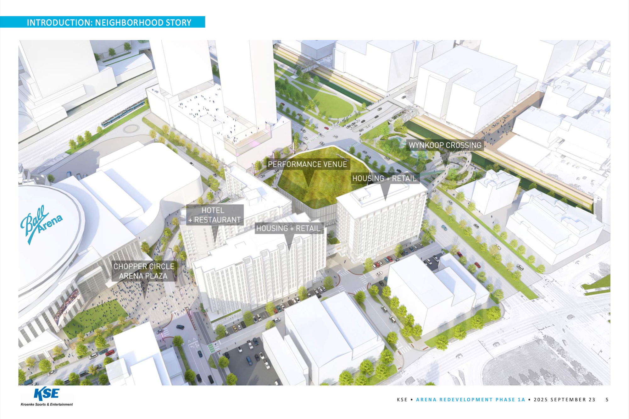
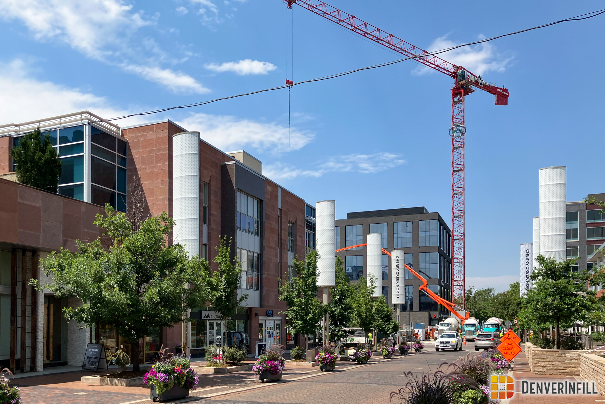
Today, in Update #2, I don’t have any new construction photos. The project is just at the “big hole in the ground” stage. Instead, what I do have is the latest renderings of the project, courtesy of Kiana at Newmark Knight Frank Frederick Ross. These images show the final refinement of the building’s design, and they are at super high resolution too! Click/zoom to embiggen and to appreciate how significant of an improvement this project is for the 16th Street Mall and the transition from the Central Business District to Lower Downtown:




This is great. Compared to some of the older renderings, it seems like the fit-and-finish and overall quality of materials is higher than I was expecting from 16M. Scanning your eye along the street level, it has three distinctly different zones aesthetically as you walk by. More and more, I’m convinced that some variation and rhythm at street level is the best characteristics an architect can give a building. It’s infinitely more important than what a building looks like in the skyline. Thanks for the update, Ken!
After cleaning up their initial design, I think this building will be a nice addition to downtown.
Overall, this is a nice looking building. It’s good to see something contemporary being built.
The brick on the 16th Street facade should come down to the ground, as it does with the columns on the west wall. With that “slit” on the west side it looks as if all of that 16th Street brick could fall off. Even though we can technically hang brick on a building, aesthetically I think it should “look” supported down to the ground. Three simple brick columns would solve the issue.
Overall the design review board really helped clean up this building. I still don’t completely like the way that the windows and balconies on the residential top portion don’t line up. It feels like an attempt to replicate what was done on Sugar3, but isn’t nearly as well executed and ends up just looking busy. Especially now that the base has been pulled into a much more orderly grid of lines, it just doesn’t match. That said, I really disliked the design when the whole thing looked more like the top, so I’ll definitely be happy with this design. Quite frankly the first 6 floors look really good now in my opinion, and they will be the most prominent part of the building anyway.
Looks good. It blends in with the highrise condo building behind it and it “book-ends” the Sugar Building with the Sugar3 building (one of my favorite recent buildings). I really hope the redevelopment of Market Street Station has a lot of retail that makes it a very active shopping node between Union Station and Larimer Square. I would love to see a beautiful fountain and/or sculpture in the plaza there. It will be a tremendous waste if MSS is just another office building. I still would love to see a great public market there, like Reading Terminal Market in Philadelphia.
I have to agree with everyone else — this one looks good. Well, the first 6 floors look good; the top looks strange. Missed one bet, though: at the top of the six-story section, below the upper section, is the perfect place for a SIGN. In the old days, buildings had names carved into them. This one could, too.