
Hello readers! Ken and Ryan here. We are excited to introduce DenverInfill’s new look, featuring a wide-screen format and a less cluttered design. Our new streamlined layout also provides an easier way to explore our 2,000 posts spanning over 10 years through the colorful grid of links displaying a representative image from each post. Other ways to get to your favorite older posts include the Search and Archives functions, now located at the bottom of every page. Some of the other navigational tools formerly located on the right sidebar, such as searching by location or by various development type and land use categories, are now found in the menu bar at the top of the page. Links to our Project Map, 3D Future Skyline, and Development Summaries are bundled under the Special Features menu where we have room to add additional unique elements in the future.
There are a lot of new features in our new design too! Click on Projects on the menu bar and there you’ll see links to the 200-plus urban infill projects we’ve been tracking since 2010. That’s pretty cool. Also, we’re really excited about our new Photo Galleries. Currently there’s nothing there… yet. But very soon we will begin unveiling our first gallery—a comprehensive collection of the 1,959 images we took of the big Denver Union Station project from groundbreaking in February 2010 to the final grand opening celebrations during the summer of 2014. We can’t wait to share them with you! The Photo Galleries section is really going to be nice because under the former design, all photographs were located only within blog posts. Now we’ll be able to present a collection of images related to specific projects or topics in one location.
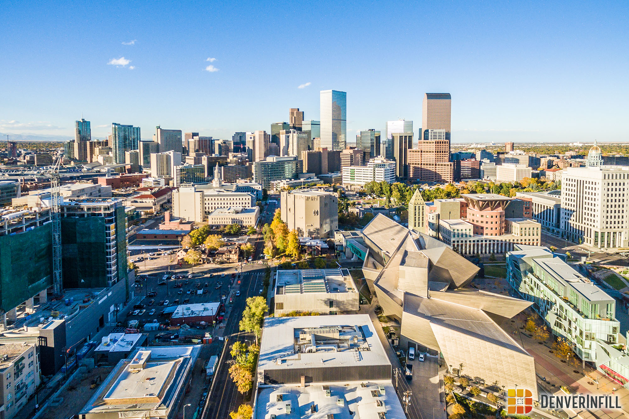
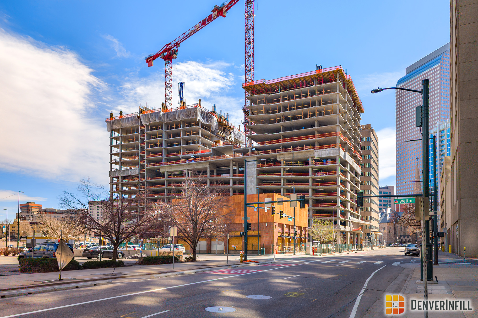
Speaking of photos, one of the things we are most proud of here at DenverInfill is our dedication to presenting you with only the highest-quality photographs of our growing city, and our new design takes advantage of that in a big way. Rather than opening each image in a new browser window or tab like before, we now have Lightbox capabilities, allowing you to scroll through all images within a post (or in a gallery) in a single full-screen window. Give it a try with the sample photos below:


We’re also geeked about another new feature: Google Maps showing the project location within a post, like the example below.
Really, how can more maps be a bad thing? We love maps at DenverInfill! The Lightbox and Google Maps features will apply to all new posts going forward.
We hope you enjoy our new look and features. Our former design was introduced in 2009, so we were due for a makeover. Our thanks to web designer Stacie Vee for her excellent work on our new design. Stacie’s work is not quite finished, however, as we will be upgrading our companion blog, DenverUrbanism, in the coming weeks.
We hope you enjoy the “new” DenverInfill and continue to join us as we explore and discuss Denver’s remarkable growth and development!


Looks great, any chance you can remove the “Read More” line break for the RSS feed
New layout looks great! I would love to see a post with an end-of-year review of FasTracks progress – perhaps with an overview of the rail system’s progress on Urbanism and an overview/map of infill adjacent to rail stations here on DenverInfill!
I love the new format. Is there a way to expand the photos to their original resolution? One thing I enjoy is looking at the fine details of the 3000×2500 and above photos.
Yes! When the image goes to the Lightbox you can right click it (or long press on mobile) and say ‘Open Image in new tab’. That’s available in Chrome. I’m sure Firefox / Edge / Safari have similar functions!
In Firefox, right click, select “view image,” and the photo expands to full resolution within the same tab. Press backspace to go back to the Lightbox.
This is excellent – it’s a great update!
Excellent new page! Looks great.
Congrats on the upgrade, I’m a big fan of the new look.
Great job on this. I’m loving it and sending friends from outside Denver to check it out. Have we ever thought about updating the comment section with Disqus or something? One thing I would love is to know when someone has replied to a comment that I have made or to follow certain comments. Similar to what Streetblog Denver/USA uses.
This is a big improvement. I love it! Can’t wait for the photo galleries!
Awesome! Looks Great!
The new update looks great! Wow, what a picture!
Been reading this blog for more than a decade, and this is a huge step forward, making it even more visual! Great work, Ken and Ryan!
Like the new format. Keep up the great work guys!