
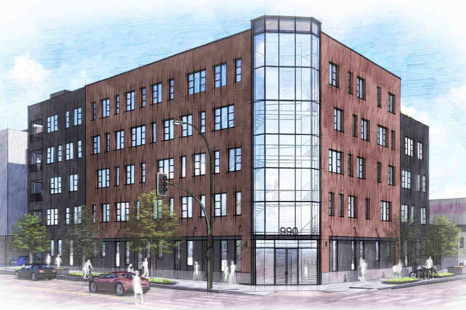
A new five-story residential building is proposed for the south corner of Park Avenue and Curtis Street in Downtown Denver’s Arapahoe Square district. Consisting of 48 for-sale condominiums, the project is currently under review with the Arapahoe Square Design Advisory Board (ASDAB).
The development is being proposed by redT Homes and the project architect is EVstudio.
First, let’s start with the project’s location using these GoogleEarth aerial and streetview images:
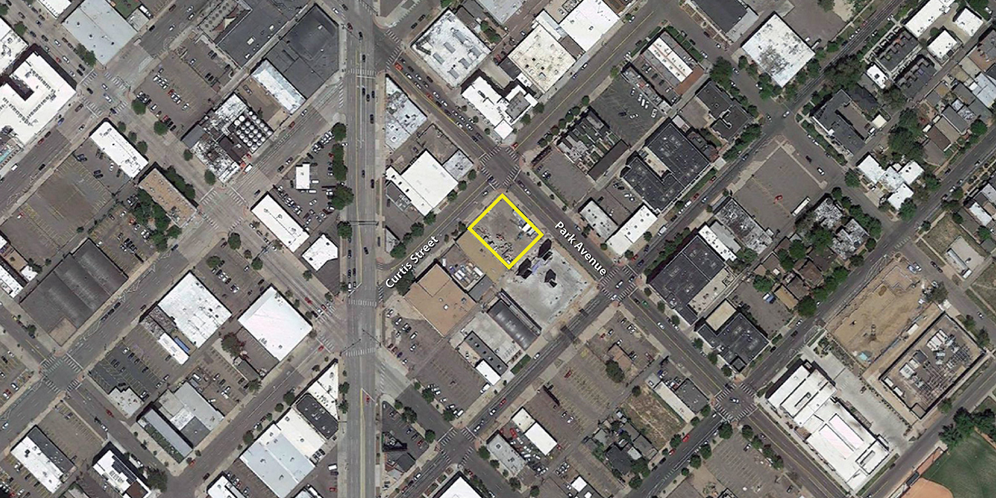
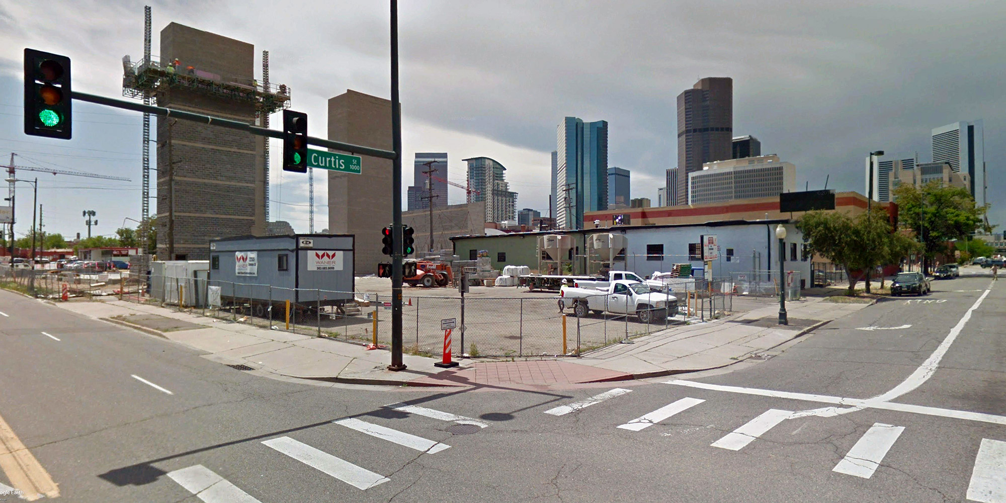
(The building under construction across the alley in the streetview image above is a recently completed self-storage facility.)
According to the project’s submittal to the ASDAB, the Park Place Condominiums will include a total of 42 automobile parking spaces located on one underground level and on part of the ground floor. The parking on the ground floor will be hidden from street view by walk-up residential units, the building lobby, a bicycle storage room, and other building services. The remaining residential units will be located on floors two through five. Parking will be accessed via the alley.
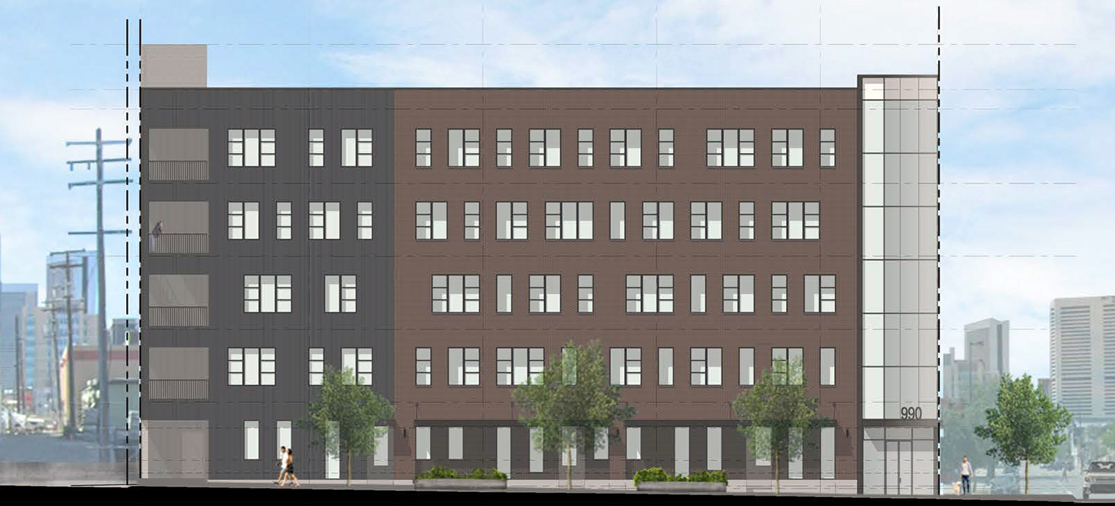
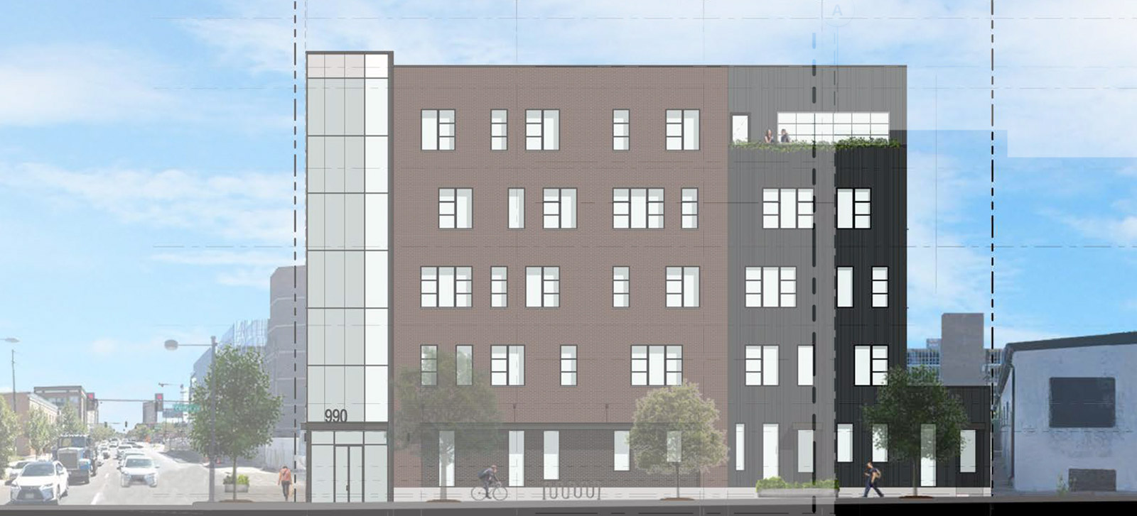
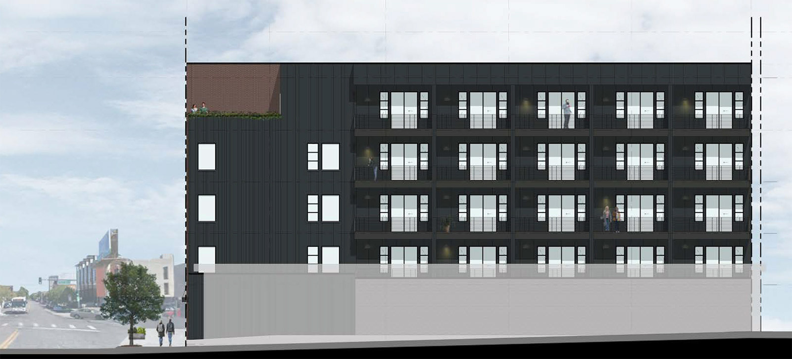
Here are three building elevations starting with the Park Avenue (northeast) elevation, the Curtis Street (northwest) elevation, and ending with the side lot (southwest) elevation. All elevations and renderings below are courtesy of EVstudio and were obtained from the project’s August 28, 2018 materials submitted to the ASDAB. Design images and descriptions should be considered as preliminary and subject to change, given that the project is still under review with both the ASDAB and the city planning office.
Two renderings showing the corner and Curtis Street perspectives:
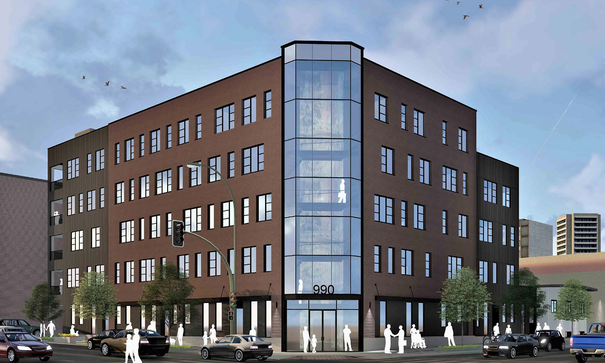
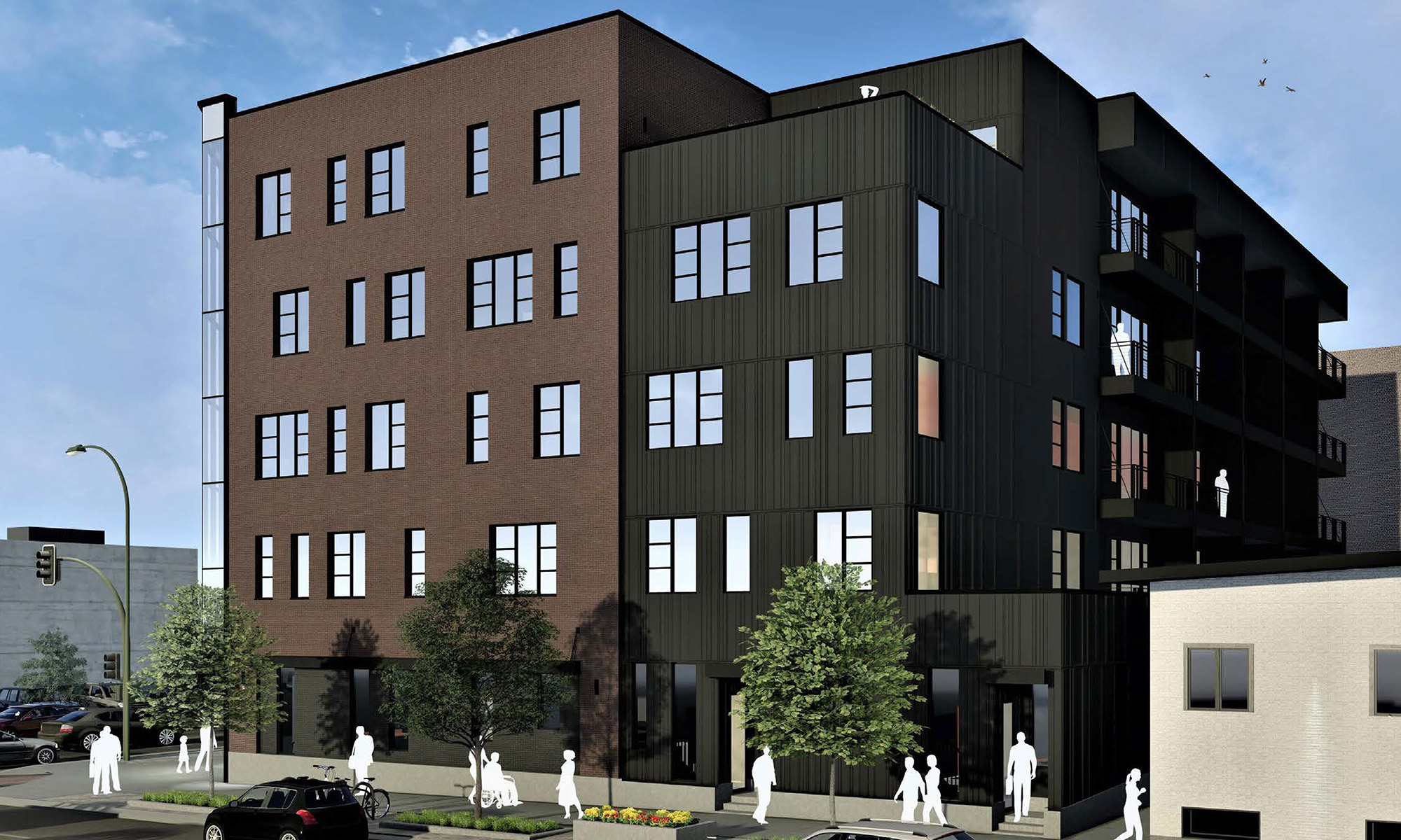
The predominant facade materials are brick masonry and patterned fiber cement, and an outdoor terrace for building residents is proposed for the top floor. The chamfered corner is a nice touch. Also, it’s great to see more for-sale condos being proposed!
We will report again on this project once it has completed the city’s review process and is ready for construction.


Nice to see more condos being developed.
Welcome to the neighborhood..! Just prepare to lock everything down – even your recyclables and garbage because you will have people rummaging through it.
Park Av and 22nd St are both still beset by large expanses of hideous surface parking lots and shabby aged underdeveloped real estate.
Many areas along both streets are regularly bathed in litter, waste, and weeds.
It will take at least one to two decades to eliminate nearly all of that.
In time the vision is for those two streets will be to take on the appearance of what we are seeing is well underway along westbound Speer Blvd as one travels NW from Cherry Creek Country Club towards I-25 and beyond.
That process along Speer has a time expanse of probably over a decade to be completed, but what has already been constructed is strongly encouraging.
Hopefully Park and 22nd from Blake to at least Welton if not Franklin/Colfax can get to that point and strongly beyond before 2040.
The City of Denver also needs to replace the existing asphalt surface with concrete on both Park and 22nd (cobblestone would also be a worthy alternative !) and place a high-profile landscaped center median the length of the Park from Market to Franklin as well as amid 22nd through Arapahoe Square that has art as part of it in that time frame.
An early hallmark idea for our coming-Mayor Brooks who will be on the job in the mid 2020s when a bond issue to fund it would be available for consideration.
What a bland, uninspiring design with such a dreary, monolithic color palate! No stainless steel or lighter stone anywhere to break up the monotony or even to add contrast or relief. Reject this garbage!
I couldn’t disagree more, and it’s a disappointing comment that indicates the misunderstanding of design and architecture that exists on sites such as this and (even worse) Denver fugly.
Buildings do not need to rely on excessively cluttered material palettes or cliche and uncalled for massing moves (curves) to have an interesting project. Successful projects come from a strong concept and thoughtful execution of the details.
How does stainless steel (SS what BTW?) or lighter stone somehow result in a better design? These are nothing but arbitrary material suggestions that have zero relationship to a design concept.
A formally simple design with a restrained material palette so not synonymous with bland or uninspired. I think it’s nice to see a mature project like this. I’d say it’s handsome and far superior to the cruise ships along Welton or the aggressively VEd VIA (9th & Lincoln).
I agree. This project’s design draws from timeless themes while incorporating contemporary elements – like the glass chamfered corner. It’s neither a kitschy reproduction of early 20th century design, nor an overtly trendy concept that won’t age well. Not a lot of project are able to pull this level of tempered balance off, and I wish we could see more of it.
Agreed! “Handsome” is a great way to describe this project!
Misunderstanding of design and architecture? I’m sorry, but that sounds a little arrogant and presumptive. Some of my critique is in the more superficial taste space, but I said nothing about curves; my biggest problem is the design and color palette. It has no cutbacks or textural contrast on the upper floors that define or otherwise shape the space beyond its very simple outer shell nor does it have even modest contrasting lines in either color or building material. It was the brutalist-modern philosophy that took this away from new buildings and most people and companies voted with their wallets against wanting to occupy such simple, monolithic space if they could afford something else. The design for an entrance under a greenhouse-style vertical matrix window pain encasing a stairwell is a design that has been tried on a lot of academic and industrial buildings in the 60’s-80’s and they didn’t age well – check out Rome Hall at George Washington University in DC as a good example – in winter especially, it is not a pleasant place to be. Angular symmetry and at least some modest color and texture contrast do make more enduringly attractive buildings that hold value over longer periods of time. Furthermore, the street level section of the building is completely wasted without any clear defining shape that draws you to the fact that there’s anything there besides a wall – the ground floor level looks like the rest of the building. Even if they don’t offer retail tenant space, it’s a waste of the opportunity to make a desirable streetscape.
To me, where there is so much underutilized space in Denver proper with a strong construction market, building “meh” is criminal because we are stuck with it forever.
I don’t mind the simplicity of this building. Materials, color and texture are going to matter a great deal. I assume part of it is brick. It would be nice to have a lighter color with some sort of texture pattern to create some depth to the surface. I don’t mind the glass chamfered corner but the way it pops up at the top looks cheesy and cheap. The ground level looks a bit forboding and dreary. It’s in it’s easy stages and I think it is a bit on the bland side. It has potential to evolve into something better though. We can only hope.
Took another look at this one. I agree with everything James has said. Especially the glass chamfered corner. It looks oh so 1983.