

Back in the summer, we covered the Hyatt Place/Hyatt House hotel when it was near completion. Now it is time to wrap things up and take a look at the final product. Announced back in 2013, DenverInfill covered this project a total of eight times. Here are all of our previous posts that mentioned the Hyatt Place/Hyatt House.
New Downtown Denver Project: Hyatt Place/Hyatt House Hotel
Upper Downtown: Hyatt Place/Hyatt House Hotel Update #1
Upper Downtown: Hyatt Place/Hyatt House Hotel Update #2
Spring 2014: Downtown Denver Hole-in-the-Ground Census
Upper Downtown: Hyatt Place/Hyatt House Hotel Update #3
Upper Downtown: Hyatt Place/Hyatt House Hotel Update #4
Upper Downtown: Hyatt Place/Hyatt House Hotel Update #5
Upper Downtown: Hyatt Place/Hyatt House Hotel Update #6
The 21-story hotel is just a couple of blocks away from the Colorado Convention Center and provides Upper Downtown with 361 rooms. This area of Downtown Denver is riddled with surface parking lots making this project a great sight and breath of fresh air on the street level.
Now to the photos of the completed project, starting out with the street level. Looking up from 14th Street and Glenarm, you are greeted with stonework on the ground floor, a thin glass curtain wall that spans the entire height of the building, and a nicely treated, hidden parking structure.

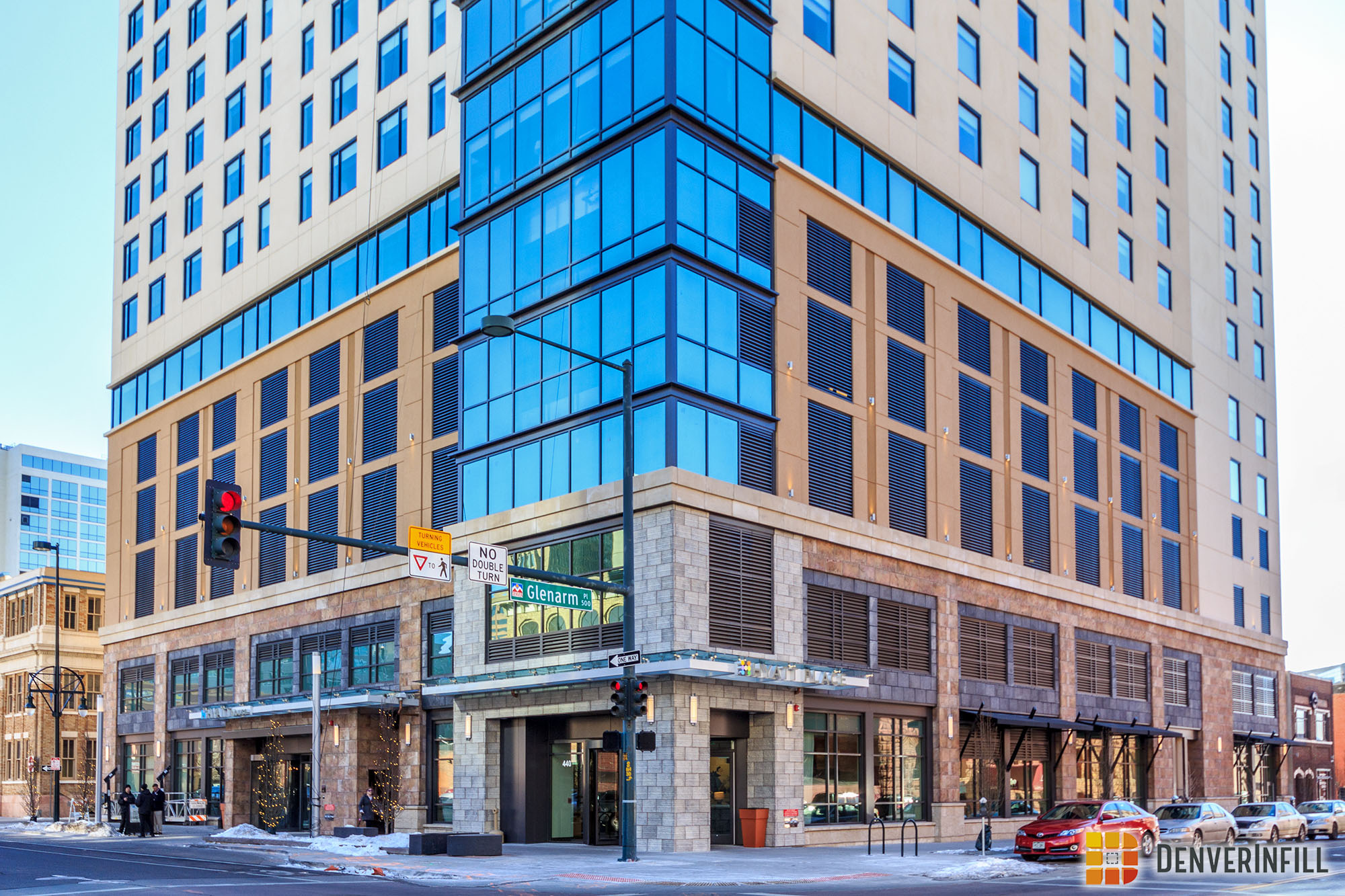
Stepping back a couple of blocks, you can see the glass curtain wall exceeds the roof of the tower and slopes up, making the roof-line visually appealing. Overall, from these angles, this project looks fantastic and provides a great street presence.


Now let’s address another element of this project that is very prominent: the blank walls. Ken discussed the topic of blank walls in great depth, covering the Le Meridien/AC Hotel project. I recommend heading over to that post for a great read on this topic.
Regardless, this project is complete and the final outcome leaves us with these blank walls. To the southeast, along 14th Street, a blank wall stands next to a historic office building built in 1923. Given the age and historic status of that building, I’m not sure why there is a blank wall; I don’t think 414 14th Street will ever get replaced.
Looking up Glenarm towards Central Downtown, two small structures sit behind the Hyatt with a parking lot further down. A blank wall makes sense here, with hopes the parking lot will develop and cover most, if not all, of that blank wall. A great example of a blank wall that is now getting covered, is over at The Platform in the Union Station neighborhood.


With two very large surface lots on the same block, there is a very good chance at least one of the blank walls will get covered in the next few years. But what about present day, while we are waiting for that to happen? Well, I found a couple of examples…

Last weekend, I visited another city that has a similar mission in their downtown: eliminate surface parking lots and become a dense, pedestrian and transit friendly urban center. There, I found dozens of blank walls next to surface lots and shorter buildings, just like the Hyatt. Since Denver has never had a real problem with blank walls, the subject of treatment has not been addressed whereas in other places, blank walls are a common occurrence. Here are two examples I found, both simple and complex. As I understand giant advertisements are not really Denver’s thing, it is a neat concept. I’m sure an artist here in Denver already has plans for these giant canvases.


The Hyatt House/Hyatt Place is a great start to adding density to Upper Downtown Denver and activating sidewalks that have been asleep for many years.


With the exception of the ground floor (which is mediocre) this is a very cheap looking structure. Not, in my opinion, a building to celebrate in any way. We need developers and financiers willing to take a risk on some higher-quality structures that may have the chance to be our architectural legacy in 50+ years. Right now, we are building buildings that may not last that long (and are, IHO, completely dog ugly)!
I concur! Many of the buildings going up have no legacy to leave accept to tear them down and build something that matches the architectural giants of Hong Kong, Singapore, Dubai. Note that American cities love their big square boxes and cheap designs.
I do not know the particulars of this project, but blank walls are more often the result of fire separation distances (measured to property lines) than future development, although not always. Set that wall back 10′ and I bet you’ll see windows, but that is a good deal of NLA to give up.
It would be nice to see something by a local artist like Evan Hecox on the blank wall.
Most complain of the large, blank walls. These are really a non-issue as they will likely be covered up by adjoining buildings in the (hopefully) near future.
What we should be talking about is the beyond-god-awful base of this building.
That fake stone is one of the poorest pieces of ‘design’ work in this entire city. Ugly and cheap.
It’s just an abomination.
Ultimately this building is better for our urban fabric than the parking lot that was there, but my oh my how that base sucks. The ‘designers’ should be ashamed of themselves.
To be fair, the Zoolander signs are facing the Staples center. Odds of covering blank walls with add would only work near Coors Field.
I say cover it with a big “advertisement” for Diamond Cabaret.
I agree that this is one of the worst buildings to go up in downtown in a long time. Isn’t this the exact reason there is a planning commission and buildings have to go through design review? Either the commission completely failed at their job or there is a problem with the process. How can we put up this crap but then tear down historic homes in The Highlands? Maybe on the blank walls they can paint the words “FUGLY” on it….
I completely agree. It’s almost as if they were trying to see just how much they could get away with in terms of a cheap looking building. Doesn’t even look like a modern building to me – looks more like it was built in the 80s.
I actually think the building been a lot worse. The base looks halfway decent compared to most things that go up these days.
The reason the blank walls are present is based on the amount of SQ footage they wanted the building to have. They cared very little about recessing the walls to make room for 360 degree wraparound of windows because that would leave them with less square footage. The project was developed from a group in Indiana, and the architecture firm was from Atlanta. Maybe the problem lies in outsourcing everything about the project to people so far away from it that they can simply ignore the ten thousand square feet of blank stucco walls. They also get away with it because the one and only rendering of this building was from the “pretty” side. The building could have been a lot worse, it also could have been monumentally better. If a taller and thinner building was built, it would not only be more attractive, but would allow more light to the street level instead of hogging it in the canopy. Maybe if they put solar panels on those walls it would soak up the sun as well as act as an attractive siding. There must be something done.